


At a macro scale, the scientific advances a society creates — from pesticides to vaccines to mobile phone batteries — create both economic growth and improvements in wellbeing. But how do we measure them?
While it’s easy to connect specific research to innovations, and those innovations to improvements in well being (Gila monster spit → ozempic → weight loss), doing so at the level of an economy is difficult.
As Matt Clancy discusses in his lecture, part of the challenge of measuring the returns to research and development (R&D) is weighing the lags in when research pays off and considering these alongside discount rates. The economic benefits of different types of R&D vary by when they occur, with technology development providing economic benefits almost immediately and basic research taking 20 years to have the greatest impact. I find this chart from Matt’s presentation helpful in visualizing when we might expect payoffs from various types of R&D funding.
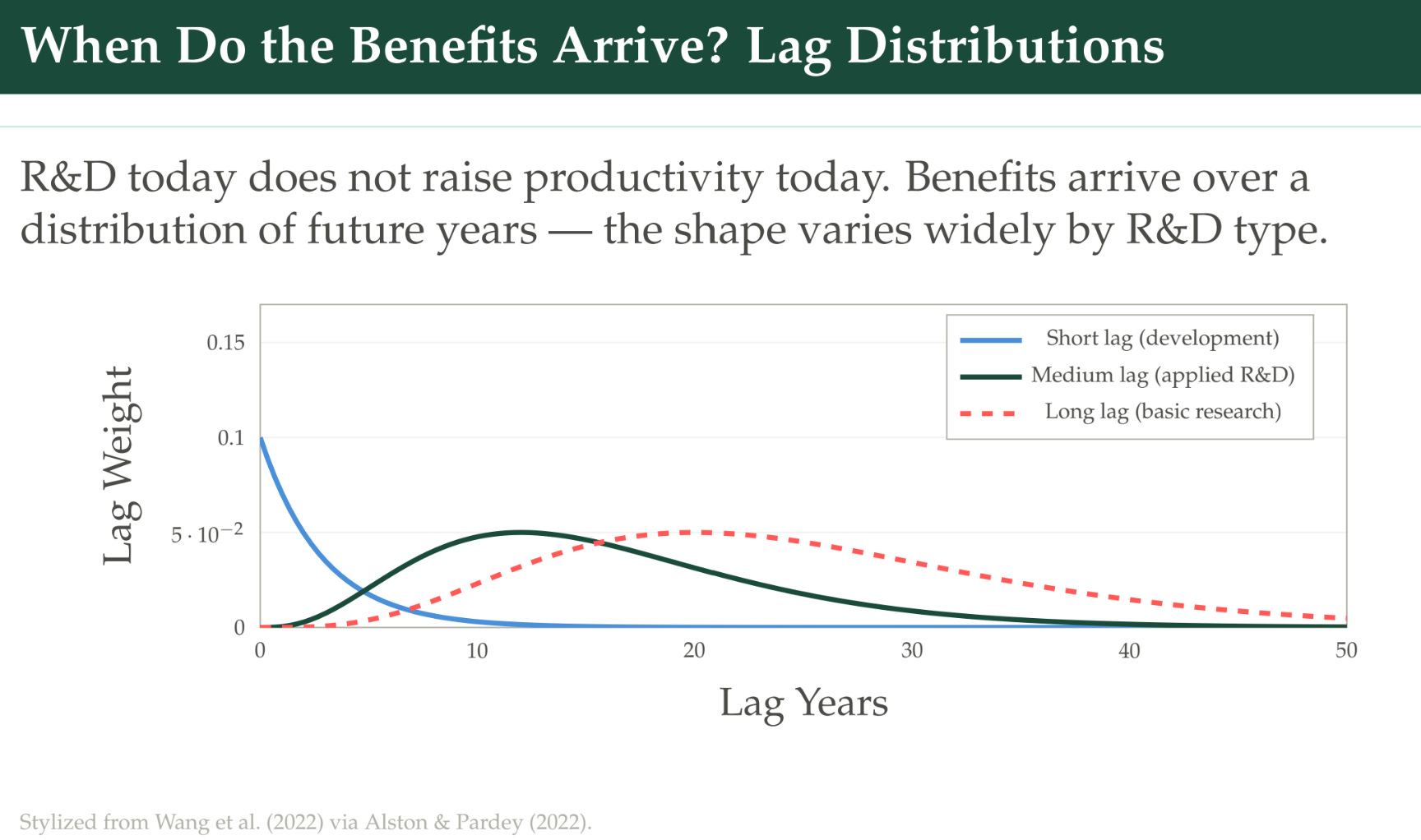
While not the focus of Matt’s presentation, this visual makes clear a political economy problem for governments that want to fund innovation. While an optimal strategy might be to patiently fund basic research that is unlikely to be supported by the private sector, it’s unlikely that political actors will be rewarded for this in a reasonable time frame. So they may be tempted to focus on development activities that can provide quick wins (but which rely on earlier basic research).
This gives us another reason to try to measure the economy-wide benefits of R&D: perhaps the measurements can help convince political actors of the long-run benefits of research investments. According to Jones and Summers, the social returns to R&D are around 67% annually. Fieldhouse and Mertens suggest that returns to federally funded, non-defense R&D range between 140% and 210%. Those are ginormous public benefits.
Matt has been interested in the returns to R&D for quite a while. His blog New Things Under the Sun has covered topics such as public R&D funding and productivity growth and the value of knowledge spillovers. Its Frequently Asked Questions section is the only FAQs section I can think of that I regularly send people to read.
Here are the readings that go with this lecture:
Azoulay, Pierre, Joshua S. Graff Zivin, Danielle Li, and Bhaven N. Sampat. 2019. Public R&D Investments and Private-sector Patenting: Evidence from NIH Funding Rules. The Review of Economic Studies 86(1): 117-152.
Dyevre, Arnaud. 2024. Public R&D Spillovers and Productivity Growth. Working paper.
Fieldhouse, Andrew, and Karel Mertens. 2023. The Returns to Government R&D: Evidence from U.S. Appropriations Shocks. Federal Reserve Bank of Dallas Working Paper 2305.
Fieldhouse, Andrew J., and Karel Mertens. 2025. The Social Returns to Public R&D. NBER Working Paper 33780.
Myers, Kyle, and Lauren Lanahan. 2022. Estimating spillovers from publicly funded R&D: Evidence from the US Department of Energy. American Economic Review. 112(7): 2393-2423.
Thanks to William Higbie and Harry Fletcher-Wood for their support in producing this video and the transcript.
Lecture Transcript:
The Returns to Science
Iowa State University is where I’m from. I did science policy when I was at the Department of Agriculture. I had a weird career. I created a living literature review on the economics of innovation that I worked on for a long time and got pretty well known. Eventually I joined Open Philanthropy, and then joined Coefficient Giving to run their innovation policy program. About a year ago I took over a fund called the Abundance and Growth Fund, which does innovation but other stuff too. Since I’ve left the university, doing the research hasn’t been as much of a focus, but I stay up with New Things Under the Sun. I did get one paper out last year with some of your teachers here — Pierre was one of them — what if the NIH had been 40% smaller? I’ll talk briefly about that later.
The other thing I wanted to flag is that at Coefficient Giving we’re starting this project called “The Pop Up Journal.” A pop up journal is a bit of an experiment in a new kind of science communication platform or format. It’s a project that lasts for a fixed period of time — five years. It’s going to be focused on trying to answer a specific question, and our first one is going to be, “What is the social return on publicly funded R&D?” We gave a grant to the National Bureau of Economic Research (NBER) to run this alongside the Alfred P. Sloan Foundation, and they’re going to have a series of conferences, commissioned research papers, and surveys. We’re coordinating research funders to provide support to do new research on this. The idea is: normally when there’s a special issue of a journal or a conference, it’s announced about a year out. If you’re working on something in that area, you go for it, and if not, you’re out of luck. This is — what if we do a five-year thing, so you have enough time to think it through, start a project, and see it through?
Why we care about the returns to science
Let’s motivate things. Why do we care about the returns to science? Let’s put on our economist hats first and abstract away from politics. We’re a benevolent social planner. If we’re going to choose the optimal level of R&D spending, we’ve got to know the answers to some questions:
What’s the return on investment from public R&D?
How does that compare to alternative uses of tax revenue? You could imagine spending it on lots of things that are public-good in nature, and growth-promoting.
What’s the deadweight loss from raising this through taxation?
The marginal return on a dollar of R&D — so we can tell if we need to spend more or less.
This is a reason to understand the ROI of R&D. In practice, people’s answer is that it’s high — but you can’t get much more specific than that, or that it’s greater than one.
Returning to the real world: government is not well modeled necessarily as a benevolent social planner, and was not persuaded to begin supporting R&D with public resources purely on the basis of academic research that showed the ROI was high. Instead, science proved its merit as important for national security and so forth in World War II. It directly contributed to atom bombs, radar, and wartime medicine. Vannevar Bush took the insights from that period and applied them to a vision for what science could look like in peacetime, saying: “We’ve seen how powerful it can be during war; the same kind of benefits can flow to us in peacetime if we continue government support for research.”
On the back of that — not just Vannevar Bush but other people too — the National Science Foundation (NSF) was created. The National Institutes of Health (NIH) had already existed, but it was dramatically ramped up and its role became this central hub for funding biomedical research. The role of the modern research university, and how it interacts with the government in terms of getting research support, kicked off here. For the last 75 years or so, there’s been this bipartisan consensus — although not always unambiguous. That’s my little potted history.
In the last couple of years, there’s been some stress on this consensus. This comes from the Trump administration proposing very large budget cuts to government support for some of the agencies — the National Institutes of Health, the National Science Foundation — proposing these 40% cuts; a 60% cut to NSF; overall one-third of non-defense R&D, which would have taken R&D spending down to the lowest levels it’s been since the ’90s.
That was just the president’s budget. The president does not actually dictate policy; he proposes it. Congress decides what it’s going to appropriate, and they largely rebuffed these proposals. NIH actually saw an increase. National Science Foundation did see a cut, and a 3.4% cut is unusually large. We’ll look at a paper later that defines large cuts as anything greater than 2.5%.
Measuring the returns to science
Before this had all shaken out, and we were unsure where things might go, I wrote this paper with Pierre Azoulay, Danielle Li, and Bhaven Sampat: “What if the NIH had been 40% smaller?” The idea was to do a very simple exercise that somebody could understand without a lot of econometric training. Pierre, Danielle, and Bhaven had access to the actual grant applications from the NIH going back to the 1980s. We could see the peer-review scores for those and how they were prioritized, and then we could chop off the bottom 40% of these grants — assume they don’t happen going back to the 1980s — and ask: what would have happened? What kind of research acknowledged those grants? What kind of drugs cited papers that acknowledge those grants, and so on. It was a descriptive paper. Our conclusion was that there’s no sign this research was just ignored and didn’t contribute anything. Over 50% of drugs had some kind of connection to these counterfactually cut papers.
That’s contemporary history. Now let’s return to our economic framework and think through how we might take into account some of these real-world things. Rather than thinking of the government as this benevolent social planner unconstrained by politics, questions about the return to R&D can matter in a model where you’re thinking of the policymaker as constrained in various ways.
How long does it take for the benefits of R&D to become manifest? Things that mostly occur after a politician’s tenure are going to be harder for them to justify as an electoral strategy to stay in office.
Geographic spillovers. If we think most of the benefits of R&D accrue to places outside the local government that’s making the spending, that might make it harder for politicians to support R&D in their area. They have to be thinking more about constituencies that are not directly voting for them.
Legibility. If you support R&D and there are benefits, is it easy to draw a line from the benefits to the R&D that you supported? If not, it’s going to be harder to get credit for the investments you made.
Steerability. If there are specific national priorities, how well can you use research to target those — versus how much is research just completely unpredictable, with the benefits mostly arising from spillovers to unanticipated uses?
Let’s talk about how science is maybe different from other parts of returns, or R&D in general. I’m going to focus not on science specifically but on publicly funded R&D, which is to a greater extent what we would call science. This is some data from Arnaud Dyèvre’s 2024 paper.
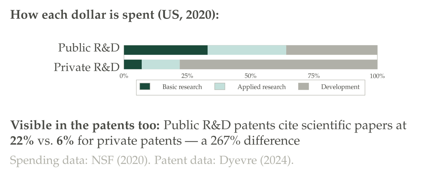
He’s got the share of public R&D that is spent on basic research, applied research, or development, and then the same thing for the private sector. You can see that publicly funded non-defense R&D is much more concentrated in basic and applied research than the private sector. You can also see evidence of a greater reliance on science in publicly funded R&D: the patents that belong to government agencies cite scientific papers at a much higher rate.
It’s useful to clarify that even though government spending is much more concentrated in basic and applied research, because the government is maybe 20% of R&D funding relative to the private sector in the US, in terms of the actual total amount of funding for basic research it’s more neck and neck than would be implied by this figure.
Why do we think R&D, or science particularly, is interesting? We can look at a couple of facts that Arnaud highlights about publicly funded R&D. He focuses on the patents of government agencies — government agencies occasionally do get patents — and he compares them to private-sector patents. Public-sector patents he calls more ahead of their time. The patent office is always updating its classification of technologies, and when a new technological category comes along they might create a new classification to put patents into. If you get reclassified into one of these, that’s a signal that you were a cutting-edge patent — a patent that later people were like, “I see now: we didn’t know it at the time, but that was one of the first quantum computing patents, and now we know to properly classify it as a quantum computing patent.” This happens more often for patents with a government acknowledgment.
They’re also cited by a wider range of technology classes than private patents, and they’re disproportionately useful to small firms rather than large firms. This indicates there’s this value of spillovers that you wouldn’t normally get — and large firms can do the research they need themselves, is one interpretation.
A second paper that tries to highlight why we think science in particular is interesting to study — it’s different from regular R&D in general — comes from Krieger, Schnitzer, and Watzinger. They’re also going to look at patents. They’re going to look for patents that are more and less directly connected to science, looking at all patents — not a comparison of government and non-government patents. They’ve got data on these patents from the ’80s to the 2010s. They’ve got estimates of the value of these patents through this paper by Kogan et al., where they look at how the stock market moves when a patent grant is announced.
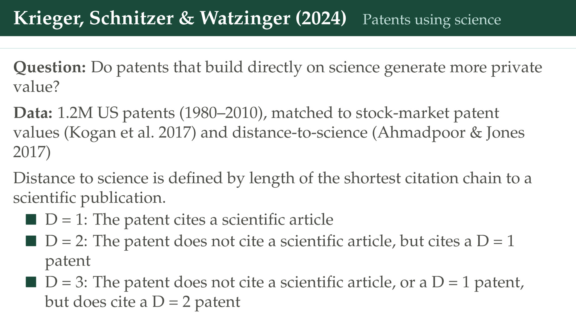
Then they’re trying to define how closely related a patent is to science based on citations. If a patent directly cites a scientific article, they’re going to say this is a “Distance 1 patent” — they’re adjacent to each other. But a lot of patents don’t cite any scientific articles. Some of those cite a patent that itself cites a scientific article; they’re going to call this a “Distance 2 patent.” Some of them go one step further: they don’t cite any science, they don’t cite any articles that cite science, but they cite a patent that in turn cites a patent that cites a scientific article.
Here’s the takeaway.
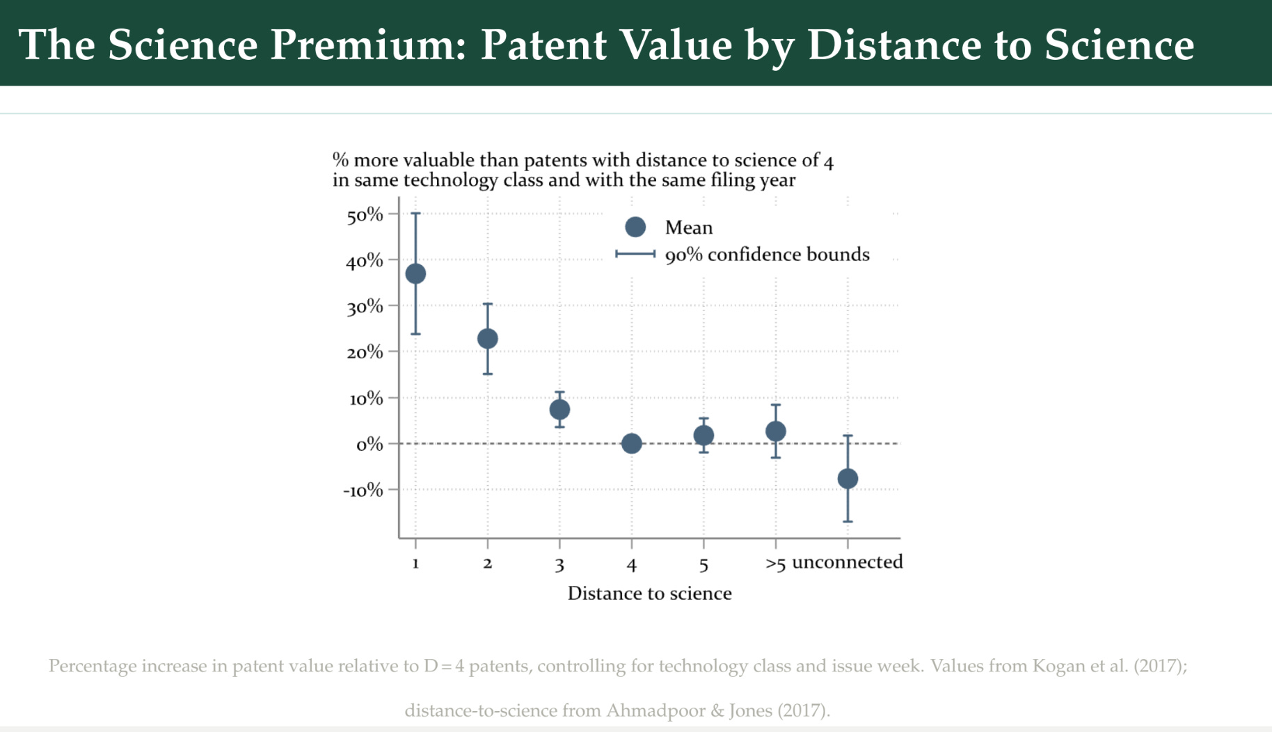
We’ve got the distance from science on the horizontal axis, and the premium as measured by these stock-market returns of the patents in these different distance categories. The closer a patent is to science, the higher its valuation.
Dissecting the challenge
We’ve motivated why we might be interested in studying the returns to science. Now let’s talk through why this is a challenging thing to do. To start with, let’s go back to the Jones and Summers paper.
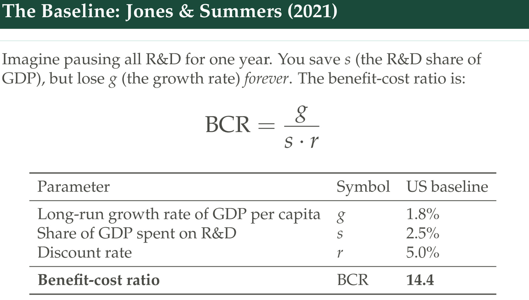
They have a simple framework where you’re imagining that GDP per capita grows at rate g over time, conditional on devoting a share s of resources to R&D, and you do that in perpetuity.
They say: “What if we paused R&D for one year? What would be the benefits and the costs?” The costs would be: we lose growth for one year, then in the future we’re always a little bit poorer than we would have been otherwise — because they assume all growth is coming from technological progress — but we don’t spend as much money for that year, and in future years we also spend a little bit less money, because we’re devoting a constant share of a lower GDP.
They do this and they cash out. There’s the benefit-cost ratio; you do some algebra and it works out to g/sr. You can plug in values for these variables based on long-run averages: 1.8% per-capita growth if you go back to the 1950s; about 2.5% of GDP spent on R&D in the US. If you use a 5% discount rate, you get this benefit-cost ratio of 14.5 roughly. So every dollar you spend on R&D generates $14.5 of present value in benefits.
There’s a bunch of assumptions baked into this. One is: which benefits are we going to actually count? What I just went through is the benefits to the United States.
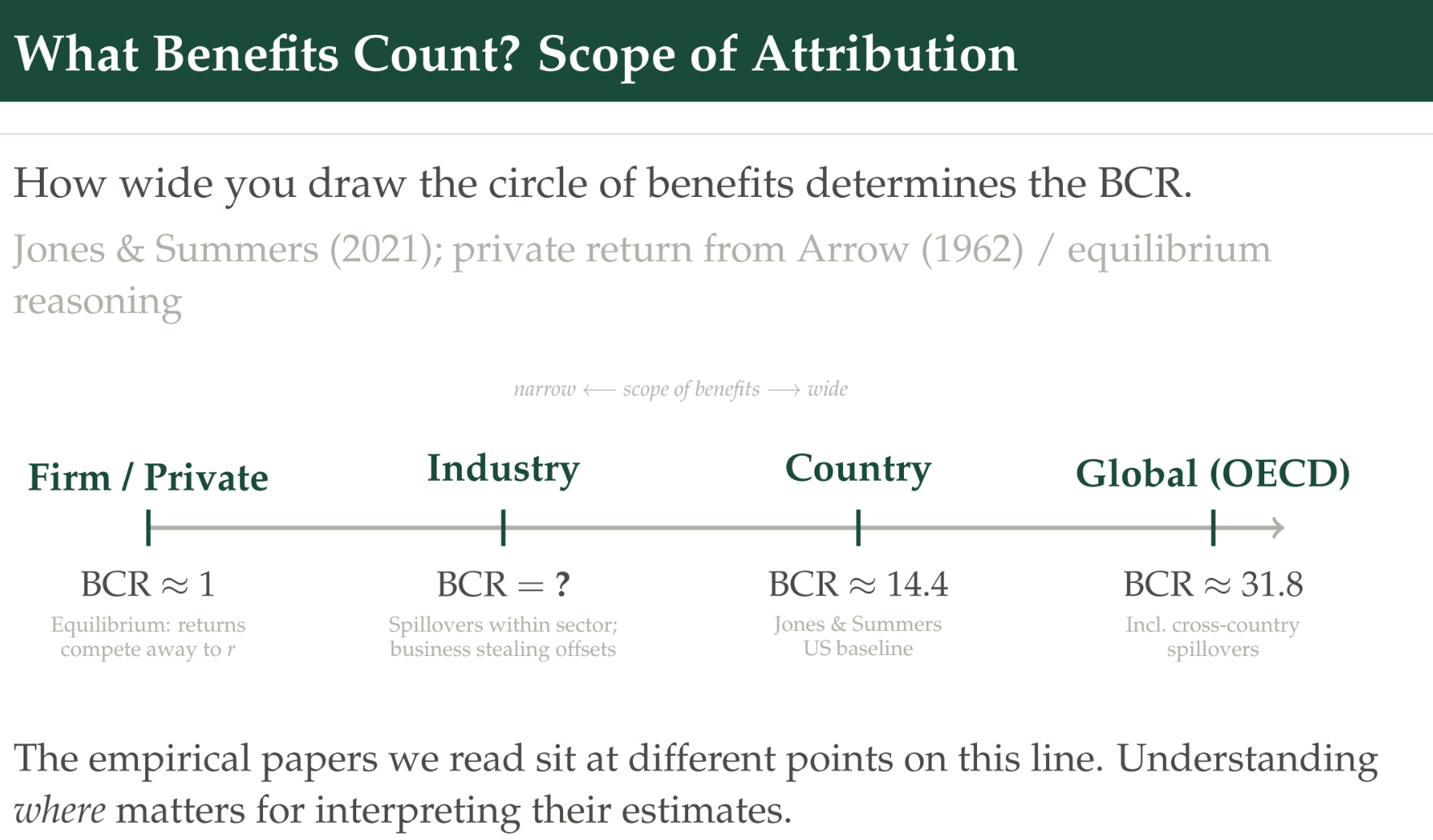
But you could imagine the benefits being on a spectrum — from the benefits that flow directly to a firm that’s doing R&D, to an industry, to a country, to the entire world. If we’re thinking about an individual firm that’s doing R&D, and we’re thinking that they’re in equilibrium — where they’re going to keep investing until the returns from investing equal their outside option, then we would expect the benefit-cost ratio to equal one — because they’re using the same interest rate to discount as they get. So that’s what we should expect the private benefits to be.
The industry could be something in the middle, or could be something different, because this equilibrium argument about firm behavior won’t apply at the level of an industry: you’ll invest until your private benefits equalize the costs, but there might be benefits that spill over to other firms. At the same time, there might be costs because you’re stealing their business.
On the global side, one of the exercises that Jones and Summers do is use similar numbers for the growth rate for the OECD — it’s not that different — but the share of global resources devoted to R&D, and they get roughly 31.8. We’re going to look at some empirical papers that you can think of as sitting on different points on this line.
Another assumption you have to think about: what kinds of benefits are you going to count? The Jones and Summers thought experiment is basically just income benefits from growth — it’s premised on this GDP-per-capita growth rate. All the empirical papers we’re going to read are also only going to focus on that kind of benefit from R&D. But I wanted to take at least one slide to pause and note there are other ways to think about this.
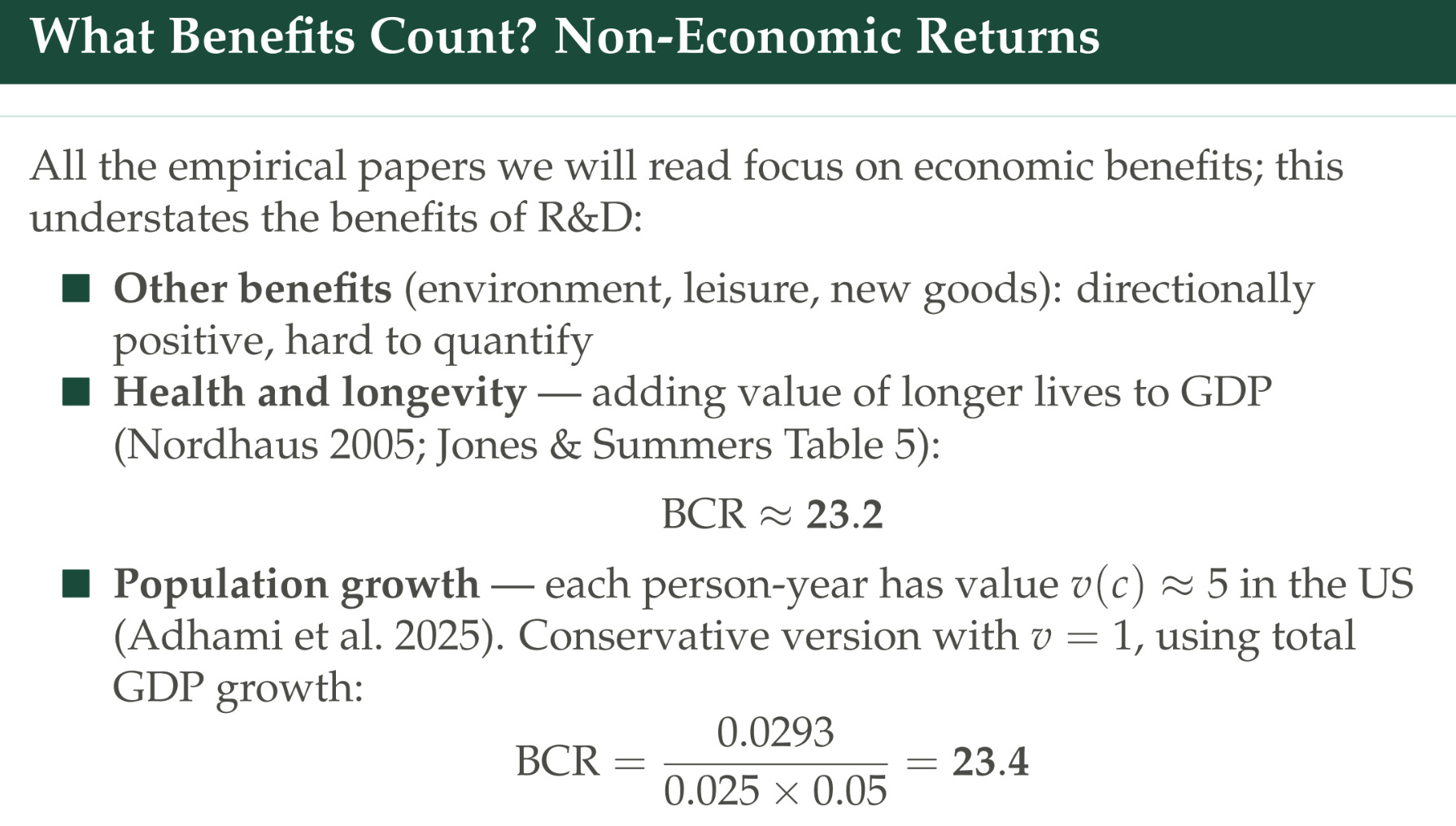
The environment — carbon emissions going down, extra leisure, the value of having access to new goods — these seem positive — a little bit hard to quantify. Although there was a really interesting paper by Phil Trammell that was trying to quantify the value of access to new goods and some other things, that showed that the traditional benefits of growth, when we’re basing it on income, really understate how much value we’re getting. He looks at the value of a statistical life and shows that if you fit a model to that, it implies the growth of utility has gone up much more than the growth of income would imply, which is super interesting.
Another thing that Jones and Summers do is look at health and longevity. One of the benefits of R&D is that we get years of longer life, and we could put a dollar value on that too if we wanted to. Jones and Summers do a couple of different exercises around that; in one of them they get up to 23.2 if you start to incorporate the benefits of R&D.
Lastly, you could think about population growth being valuable itself. This is more philosophically treacherous terrain to dabble in. If you think each person’s subjective well-being is additive to the total utility function, then being able to support a larger population is itself valuable. You could imagine using a benefit-cost ratio where, instead of GDP per capita, you’re just using GDP — so you’re multiplying by the number of people, not just income per person — and you can calculate other things that tell you how you would value that.
Another angle about benefits you have to think about more carefully is when do they arrive? R&D that’s done today, especially science, does not raise productivity today. The benefits tend to arrive over a long time. We’ve got a couple of different lag structures illustrated here.
The blue line is what is often assumed in empirical R&D papers, where the benefits are strongest today, then there’s this rapid depreciation of the rate of knowledge — often assumed to be the same as the depreciation rate of capital. Ideas that were developed 10 years ago are generating a lot less value than ideas generated today. That’s probably a truer assumption if you’re looking at the private sector, where their R&D is more development and closer to impact. But for science, it’s probably a worse assumption.
Some of the agricultural economics literature — because I used to be at the Department of Agriculture — has thought a lot about this in the context of public investments in agricultural R&D. They use these black and dotted-red-line structures, where the benefits are small at first — you can think of a new kind of seed variety diffusing out, being used by more farmers and having more impact over time. Then over time the value of that research declines. In agriculture it could be because pests evolve and are now reducing the yield of that new seed variety, or because new, better seed varieties have come along that make use of the one you developed earlier.
What if we want to incorporate timing and lags into this benefit-cost ratio? Jones and Summers talk about how you could do that.
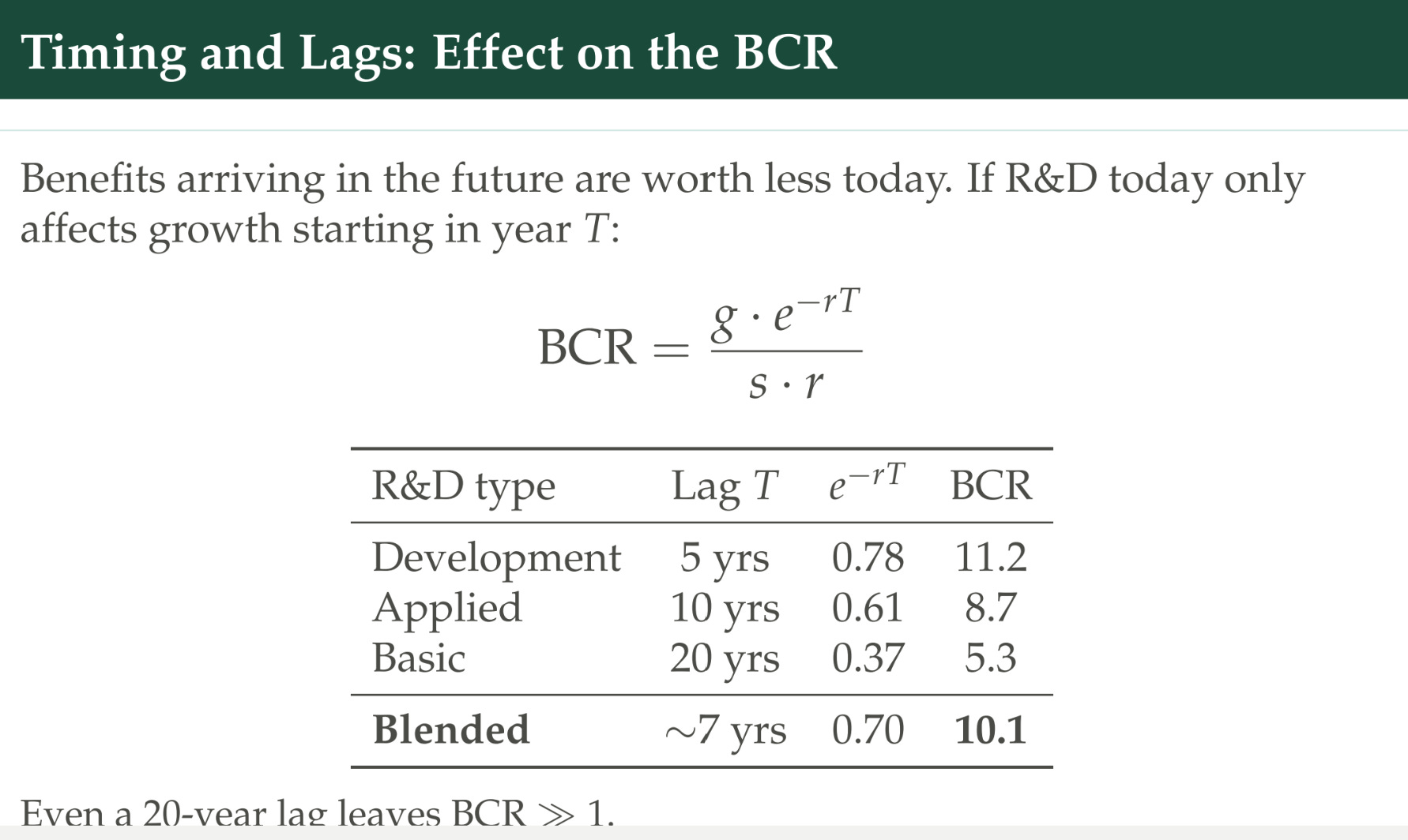
You just add a discount rate to the growth, which is like the benefits you’re getting from R&D. You could go through an exercise where you assume development takes five years, applied research has a 10-year lag, and basic research has a 20-year lag. If we apply a discount rate of 5%, we get these different benefit-cost ratios for these different kinds of research. Assuming the growth benefits are equal across them, stuff that occurs farther in the future is going to be worth less. If you take a weighted average based on how much R&D is spent on development, applied, and basic research, you get this updated benefit-cost ratio of 10.
We had this slide showing that the benefits to R&D could decline over time past a certain point.
Why is that? It turns out the knowledge-depreciation-rate question is important. Whether you’re thinking about the private or the social return of R&D matters, because these can move in different directions.
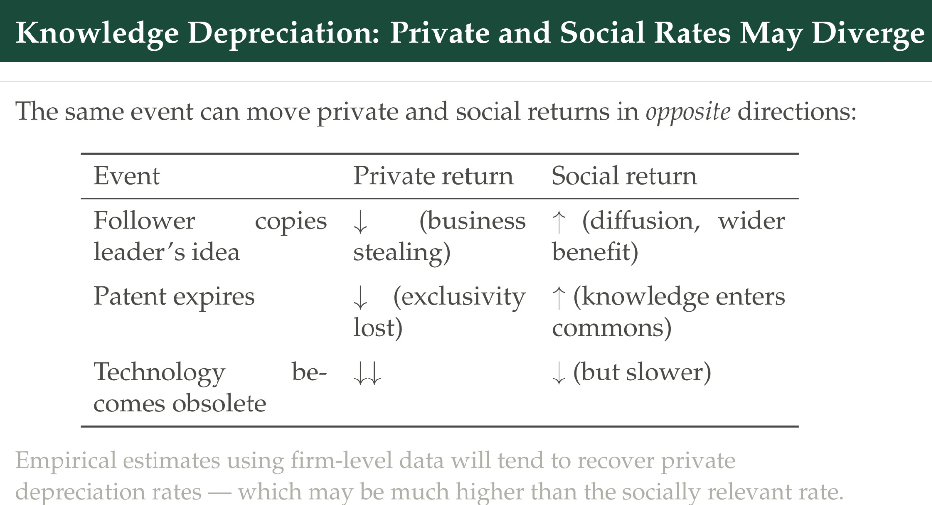
If you’re a private firm and somebody copies your idea, your knowledge is now worth less — to you, the value of that knowledge has declined. But it might be that the social value has begun to go up, because now access to the idea is wider, consumer surplus will rise, and so on. Similarly, when your patent expires, you lose your exclusivity — you could imagine that the value of that research you funded has completely dissipated to a private firm. But on the other hand, that is when it enters the market for generics and lots more people might get access to the R&D that was done.
On the other hand, you can imagine the technology becomes obsolete — a similar problem if you’re a private firm, but in this case the social return might go in the same direction. Society at large is also not benefiting anymore from the R&D that was done. Even here, though, you have to think: did the idea go obsolete because the technology that supplanted it came from a different angle and did not build on the ideas itself? Or was it an improvement that built on those ideas — they were fundamental and necessary to get to that next step? If you’re in the second case, it’s not clear that the ideas really ever fully dissipate, because you couldn’t have gotten the new, better technologies without first developing these old ones.
I also wanted to highlight that some papers take a different approach to this whole question. I’ve been framing this around — we do the R&D now, and the benefits come in the future. But we could also think about the reverse, and some papers do this — here are the benefits, they’re coming in today, we’re measuring something like the number of clean-energy patents that were around in 2008 or 2009. Rather than looking forward, they look backwards and construct an R&D stock, saying the R&D stock today is the useful knowledge available to the firm today to invent things, and that is a weighted average of previous R&D investments.
This is a pretty common approach.
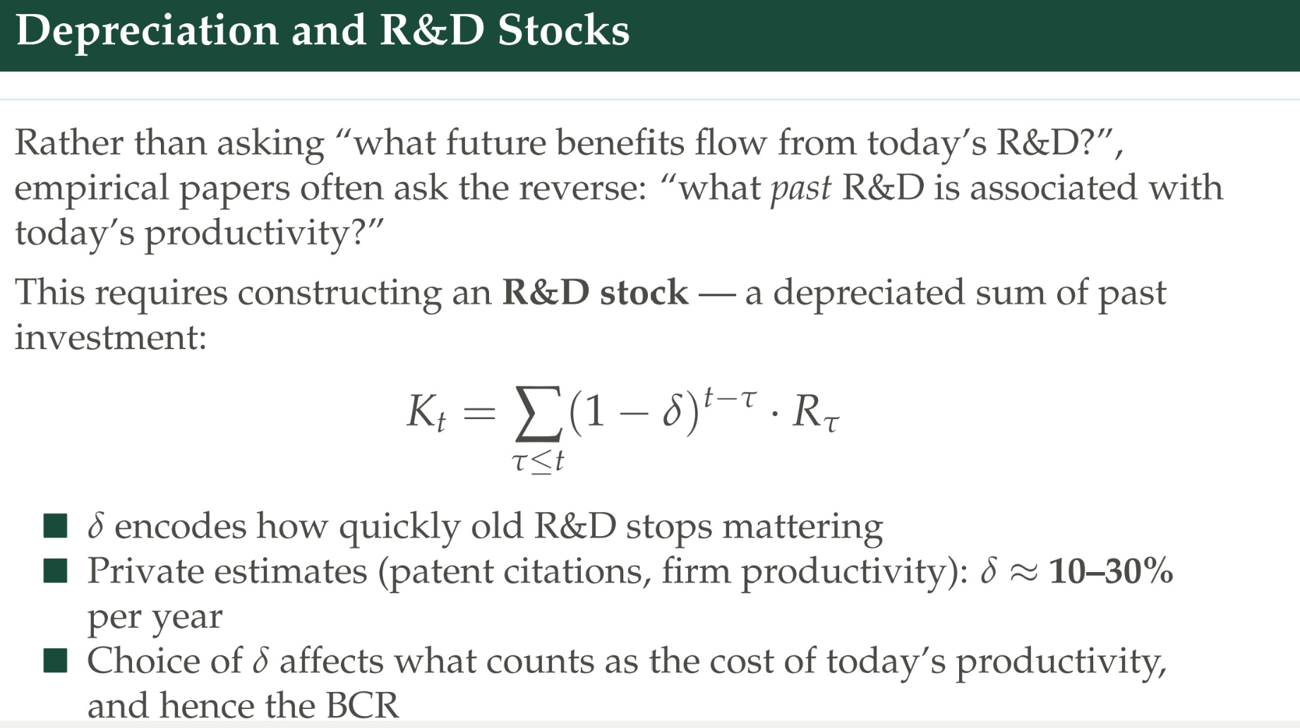
They usually do a standard depreciation rate for R&D investments that happened in the past. It’s often assumed that you use 15% or 20% as the depreciation rate, which is similar to the depreciation rate on capital. In a lot of these applications, the exact choice doesn’t actually matter that much — if you difference the data, for example, then it doesn’t matter that much. But in practice, that’s often what people do.
Another issue: what’s the denominator of this benefit-cost ratio? What kinds of costs should we be thinking about as relevant?
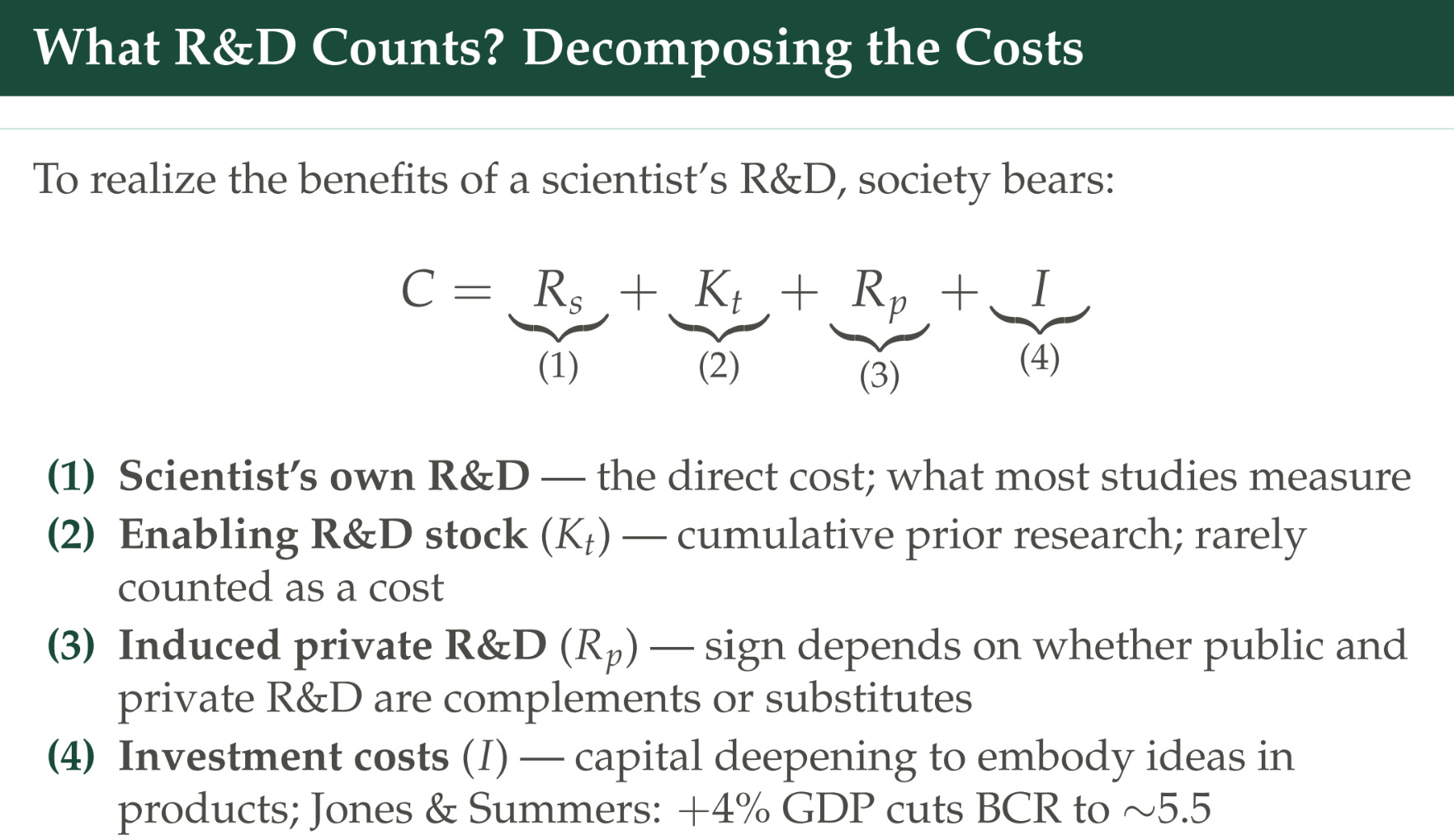
Here, I’ve divided the cost to realize the benefits of R&D into four different pieces.
There’s the R&D that was done by perhaps a specific scientist of interest — maybe we gave a grant to a scientist and we want to know the return on that grant. What happened that wouldn’t have happened when we made that grant?
Should we also think about the cost of the enabling R&D stock that was done prior? In practice this isn’t usually counted. As a specific example, you can imagine AlphaFold as having two costs: the cost from Google DeepMind to build it and train the model, which would give you one return on investment depending on what you think the benefits of AlphaFold are. Or you could add in the billions of dollars that were spent on assembling the Protein Data Bank, on which it did all of its statistical machinery.
A second way you could go: there could be induced private R&D. AlphaFold is this useful technology, but it isn’t going to generate commercially useful results without further fine-tuning; maybe it needs some scaffolding and some things to be used, and maybe other firms build on top of it, or maybe Google invests more before it finally gets there. It’s often the case that science funded by the government, or private-sector science — you can’t just pick it up and turn it into a product; there’s a lot of applied development and research that comes after the fact, and you might want to count that. But you could also think of ignoring it, in the sense that the scientist’s own R&D is counterfactually impactful: if you hadn’t made that grant, you wouldn’t have gotten the benefits. It depends on the application you’re doing.
The last piece is the cost of not even R&D, but just the costs of investment to realize the benefits. The COVID vaccines are a good example: it wasn’t that hard to figure out the code of the mRNA that was going to be used for the vaccine, but to actually get the drug in everybody’s arms, you had to invest in these giant manufacturing and distribution services. Jones and Summers think a little bit about this and say: what if we think of capital deepening as part of the cost of R&D? Capital deepening, they argue, you can use as a proxy for this investment. That’s maybe 4% of GDP in addition to the 2.5% that’s spent on just R&D, and that cuts your benefit-cost ratio down to 5.5.
Lastly, we can think about adapting Jones and Summers to estimate the benefit-cost ratio of science specifically.
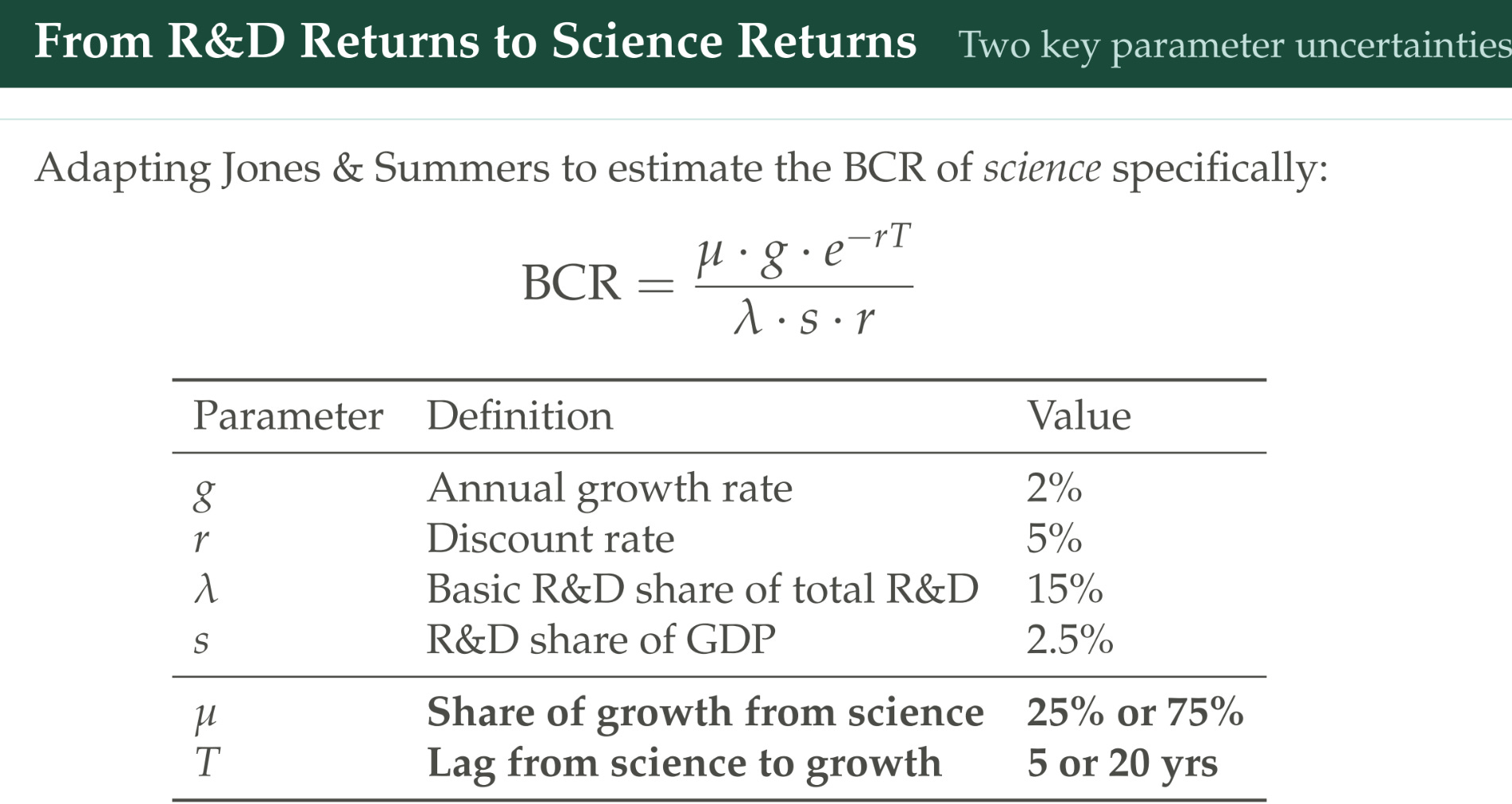
Their default is about all R&D. But let’s think about if we cared about, “What is the return to science?” A simple way to do it is to modify their equation two ways. On the numerator, we’re going to add this μ term, which is essentially: what share of the benefits from R&D are attributable to science? We’re going to say, “If you just stopped science rather than all R&D, how much would that affect the growth rate?” Maybe it wouldn’t; maybe we would get most of it; maybe we would get a little bit. For illustration I picked 25% or 75%, just as illustrative bounds.
There’s also the question of how long the lags are until we get the benefits of science. Again for illustration: if you assume it’s five years, which is common in these literatures, or 20 years, which is more in line with the historical evidence, we’ll look at how that affects the answer. Lastly, λ is the share of science in all R&D. If we spend 2.5% of GDP on R&D, roughly 15% of that is going to be basic R&D, which is the closest analog for science.
I’m not saying these are canonical — these are just illustrations of how these different assumptions matter. If you assume that science accounts for 25% of growth but it takes 20 years to show up, and you use all the rest of these variables the same, then the return to R&D is about 10. If you’re a real optimist — that science drives everything and it doesn’t take that long in the modern era — then you could get returns of 60-plus.
This is the set of problems we’re going to have to deal with. Jones and Summers is really informative that the returns have to be at some high level. But we’ll feel more comfortable if we have some empirics to back that up. That’s what we’re going to turn to now: a couple of empirical papers that try to estimate something close to these benefit-cost ratios.
What do the empirics say?
We’re going to look at four papers, and they’re going to go from most zoomed in to most zoomed out:
Myers and Lanahan — the most zoomed in. This looks at the Department of Energy, and a specific grant program within it: the Small Business Innovation Research (SBIR) program.
Azoulay et al. — zooming out to all the NIH extramural grant funding, looking at biomedical innovation.
Arnaud Dyèvre — R&D levels across major agencies in the United States, tied to the productivity of individual firms.
Fieldhouse and Mertens — total non-defense R&D spending by the government and total aggregate national total factor productivity changes.
One problem we haven’t totally left behind — a classic problem that is not unique to R&D — is identification. In the R&D context, the specific challenge is that R&D is not randomly allocated. If we just look at places that got R&D and what the benefits were, and compare that to places that didn’t get as much R&D, that’s going to overstate the value of R&D. We have these entire peer-review processes to try to find the most promising places to stick our R&D dollars: the places that get more R&D dollars we should expect to have higher returns anyway.
We need to find ways that R&D varies that are not correlated with what’s often called technological opportunity. The papers we’re going to look at have a couple of different approaches:
Program rules and discontinuities — getting into the Byzantine details about how agencies make funding decisions and trying to find situations where it’s quasi-random.
Policy variation that shifted funding for reasons uncorrelated with science.
Reading through history — trying to figure out narratively why different changes to R&D happened, and highlighting ones that were uncorrelated with what we think are major confounders.
Myers and Lanahan: Department of Energy SBIR
Let’s start with the Department of Energy’s Small Business Innovation Research program. These are competitive grants given to small firms that are responding to specific technological solicitations. This is a little bit different from the NIH, where you might be able to just propose an idea. This is more like: the Department of Energy is looking to fund solar energy, or looking to fund battery technology, and they’re going to announce a grant program around this — $200 million a year.
What’s interesting is Myers and Lanahan are not looking at what happens to a firm specifically when it gets funding. They’re looking at what happens when a technology area gets more funding. We want to look at both that area and — if we think spillovers are important — what happens to closely related technological areas, especially by firms that didn’t get a grant. We might fund a firm to work on solar technology, but maybe that will have applications in battery technology.
Why are they interested in this? Because these funding opportunity announcements about what kinds of technology we’re looking to fund help you pin down exactly what we’re trying to fund. The Cooperative Patent Classification system lets you map how close different patents are to what the agency was trying to fund. Then they use natural language processing to link these two up without citations. This is a 2022 paper, meaning it was written a couple of years earlier, so when we say natural language processing, it’s the old-school type, not the new large language models.
We still need to solve that identification problem. They don’t want to look at what the Department of Energy funded. Instead, they’re going to look at the states that these firms reside in, because some states have programs that will match or partially match an SBIR award. These matches are not subject to the same selection criteria — they don’t match if it looks particularly promising or not; they just match if you got an award. They argue that whether you get this windfall depends less on how good your technology is, and much more on whether firms that win happen to be located in states with these programs in the years those programs are running.
So there’s a cash drop into solar technology R&D because it just happens that somebody won an SBIR grant who was based in Iowa in the year Iowa had a program like that. That’s their argument. They do some work to try to show this is quasi-random: the states that are matched don’t tend to be secretly more productive anyway; firms aren’t relocating across borders to try to get into match states; and some major states that we care about don’t have these match programs.
Here’s what it looks like over time.
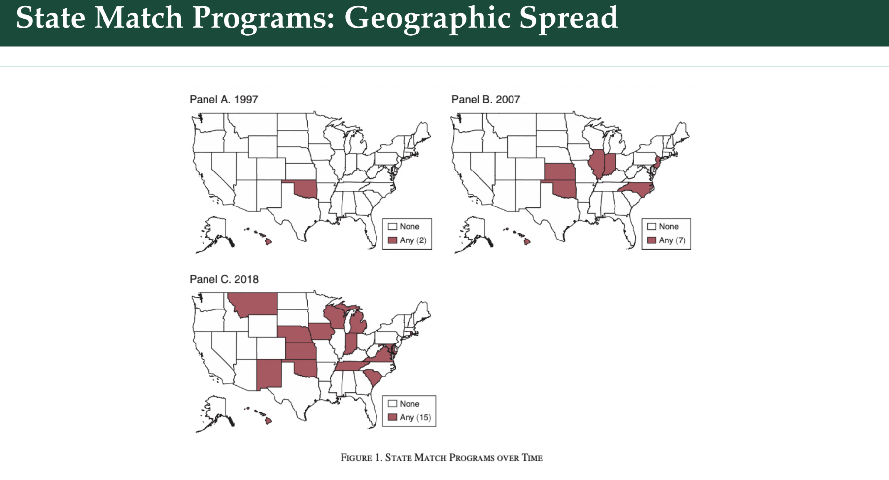
You can see in 1997 just two states — we’ve got Hawaii there. In 2007, 10 years later, a couple more states. In 2018, still some more. It’s also notable that we have some programs that shut off. Here we’ve got this guy — I’m terrible with geography — he’s in the club, and then in 2018 he’s out of the club. So it’s not just that we keep adding every year.
To measure the spillovers, normally what you might do is say: “This firm won a grant, it got a top-up, we look at the patent classification system for the patents that it took out, and we look at who cites patents in that.” But they’re worried that citations are a bad proxy for how related technologies are to each other. There’s a lot of evidence that firms’ citation of other patents is a really noisy indicator that can be misleading. You don’t cite a patent for the same reason you might cite an academic paper. Academics are used to thinking, “I understand how citations work, I cite stuff all the time in my own work” — but patents follow a different set of logic, where what you choose to cite can affect how your patent is processed.
Is the top-up simply exacerbating the SBIR selection? You could imagine saying, “We’re still disproportionately likely to get funding — it might be that the Department of Energy thinks solar is the best, so they give more awards to a solar program, and then a solar firm is more likely to win an award just because they got a grant, and so they’re more likely to randomly win this thing.” The way to think about it is: imagine there are 10 winners for this program, ranked from the first-best to the 10th-best, and the probability that one of those 10 wins one of these matches is essentially random conditional on winning. It doesn’t matter that you were the best program according to the Department of Energy — that’s uncorrelated with whether you reside in one of these states. That’s how they would probably defend this.
Their approach is, instead of looking at citations: look at natural-language-processing similarities between the text from the Department of Energy that’s issuing this call for proposals and the patent abstracts that belong to a given Cooperative Patent Class. As I said, this is old-school natural language processing — do you use a lot of the same words, giving more weight to words that are uncommon in the corpus? They’re also going to look at geographic distance: how far away are you from the firms that won this award?
Here’s their topline result.
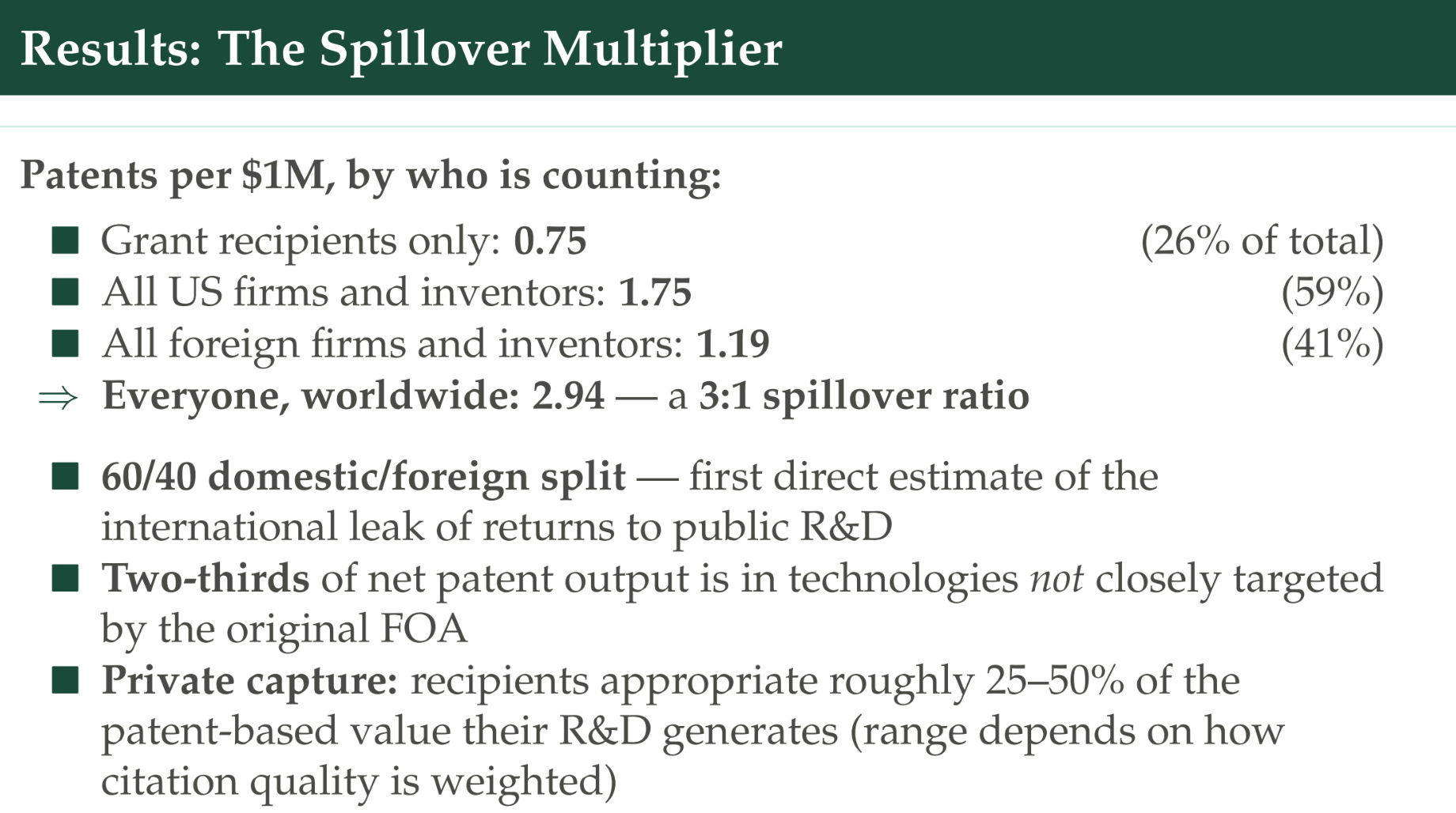
For every million dollars in windfall funding, the grant recipients turn out another 0.75 of one patent. But if you look at all US firms and inventors — people who are close to this funding opportunity area category — and you’re assuming that some categories are randomly getting these cash drops and some aren’t, then this is now 1.75. If you include foreign firms we’re getting up to 1.19. An important takeaway for our returns-to-R&D question is the gap between the private return versus the total return estimate. In terms of number of patents, there are three times as many patents attributable to dropping money into this program that are not performed by the person who actually got the money. A lot of it comes from foreign actors, and from patent outputs not closely targeted by the original solicitation — implying that spillovers are a big deal and hard to predict, and the firm that receives them is not getting a majority.
I’ve presented the raw patent count. They also do a version where they weight patents by how many citations they receive, which is a common way to value patents. When you do that, you find that the recipients capture a larger share of the total value — more like 50% rather than 25%.
For each of these papers, we’re going to grade them on some of the issues we highlighted:
Scope — what benefits are we counting? This is only looking at patented inventions. It’s nice that we’re looking at national and global spillovers, but still, a lot of invention doesn’t show up in patents.
Costs — this is only looking at the costs of the Department of Energy’s SBIR grants; we’re not thinking about all the other R&D spent to enable this type of work.
Lags are not really a focus. They do some suggestive work that a five-to-seven-year production lag is right, and then stick with that.
Identification — they thought a lot about this, trying to find plausibly exogenous variation. They have a nice scatter plot showing the ROI in terms of patents per million dollars spent: if you just look at the raw number, how much the Department of Energy gave to this program, versus looking only at the state-match funding — the OLS, the raw naive one, significantly overstates the productivity of R&D.
Measurement — they innovated by going beyond citation trails. They redo their analysis relying on the classic citation method, and that would have missed a large chunk of all the spillovers.
Azoulay et al.: NIH grants
Next, Azoulay et al., about NIH grants.
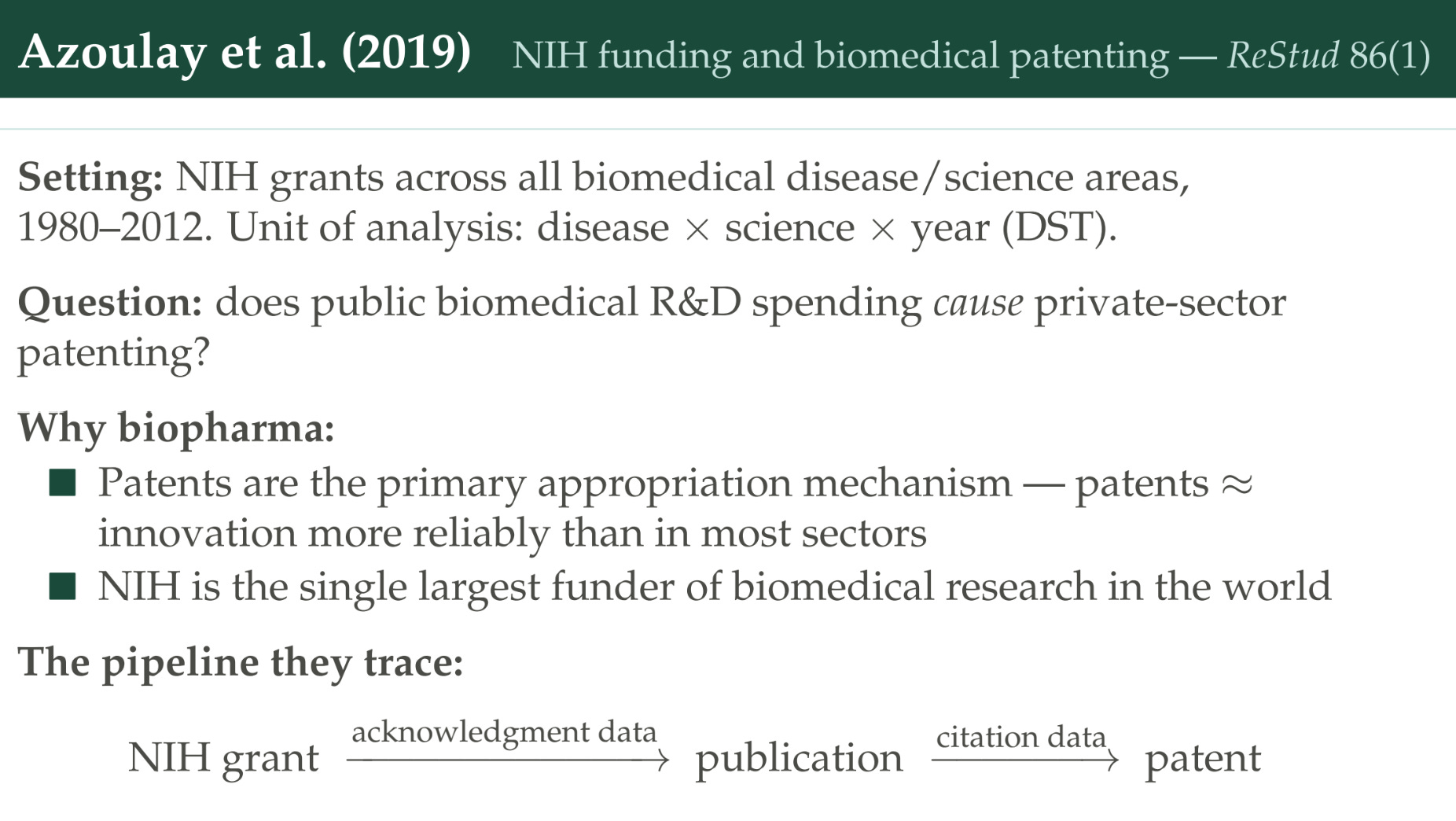
In this case the unit of analysis is going to be the disease-science-year. You can think of this as funding for cancer research using genomics in 2008. So it’s not all cancer research; there might be cancer research that’s also using exercise science in 2008, and that would be a different unit of observation. Their question: does biomedical R&D spending cause private-sector patenting?
Why are they interested in this sector? The biopharma sector is a really good one in terms of how well patents capture innovation. To get a drug on the market, the FDA has to approve it, so we have an objective count of how many new drugs are developed, and we can see how many of them actually have patents — and most of them do. We’re not missing a large share of at least drug innovation in this sector. Secondly, NIH is an important funder — it’s the biggest funder of biomedical research in the world.
Their approach is like what we did — this work inspired the paper we wrote later. It’s the same approach: a grant is made; you can tie it to a publication by seeing if the publication acknowledges support from that specific grant; and then you can draw a link between a patent and a publication by looking at whether the patent cites the publication.
How do they handle the identification strategy?
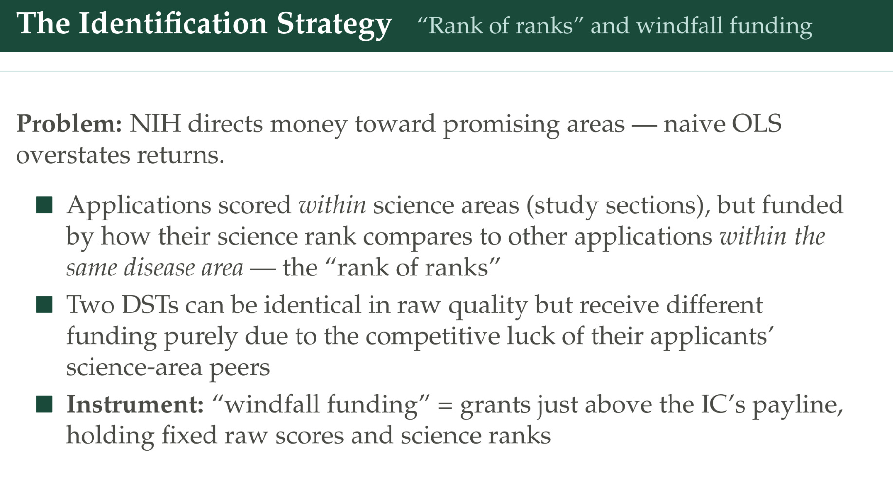
Just like the Department of Energy, certain disease-science areas in a given year are going to receive more funding because the research agenda is more promising in those years. They take advantage of the fact that the way the NIH scores applications is complicated and Byzantine. First, a review panel looks at all of the proposals within a given science area — so we’re looking at cancer-genomics proposals, but also kidney-disease-genomics and neuro-disease-genomics proposals. All the genomics stuff is being ranked, peer-review style, putting them in order from top to bottom.
After that process happens, the applications get shuttled off to the disease area. Now I’m the cancer division, and I’ve got my proposals from genomics and from exercise science. I can see — this exercise-science cancer research proposal was the best one, they gave it a 1; this genomics one was the fifth-best one the genomics people saw, so it’s number five. That means this exercise one gets funded before this genomics one — but there’s actually been no comparison between those two specific proposals. It could be that the genomics one is in fact better, but there was no venue for comparing across the different science areas in that way. It’s called the “rank of ranks.”
Their approach is to say: let’s look toward the end of the line, where there’s the cutoff, and we aren’t going to fund any grants below that cutoff. We’re going to argue that down there it’s kind of random whether you got funding or not. They look at the five grants above the payline and the five grants below, and say: “If you happen to lie above it, that’s like windfall funding for your science-disease area in this year; and if you’re below it, that’s your counterfactual — you were very close, but you didn’t quite get it.”
That’s how they measure this windfall funding to different kinds of research. Then they have this approach to figure out the effect on biomedical patenting. As I said, grant acknowledgments link them to publications, and citations link those to patents. But there’s potentially a problem if they only do that. It might be that the main way NIH-funded research affects drugs doesn’t show up through this channel. What if I get a grant, and make a major breakthrough, and my major breakthrough is a foundational paper that spawns an entire new literature of related research? Maybe lots of patents will cite the secondary literature that I inspired, but they won’t necessarily cite me, so my contribution will be invisible. One thing they try to do to take care of this is look at patents related to the patent that acknowledges grant support, using the PubMed keyword similarity — an algorithm at the time to find related science. They do it both ways, so you can see how much it matters, and they’re going to be agnostic on lags.
They find that lags are very long: their paper charts top out after 15 years, but there are still benefits occurring at that time, and they’re variable. They find that spillovers are really large. It’s very commonly the case that you make a grant for one disease area, but the patent that ends up citing that research is for treating a separate disease. One caveat: recall we just saw the Myers and Lanahan paper arguing that citations might miss a bunch of the story, so we may be missing some share of the impact here.
Their core result: $10 million in NIH funding is associated causally with another 2.3 private-sector patents, and a large chunk of this comes from spillovers that cross these disease boundaries.
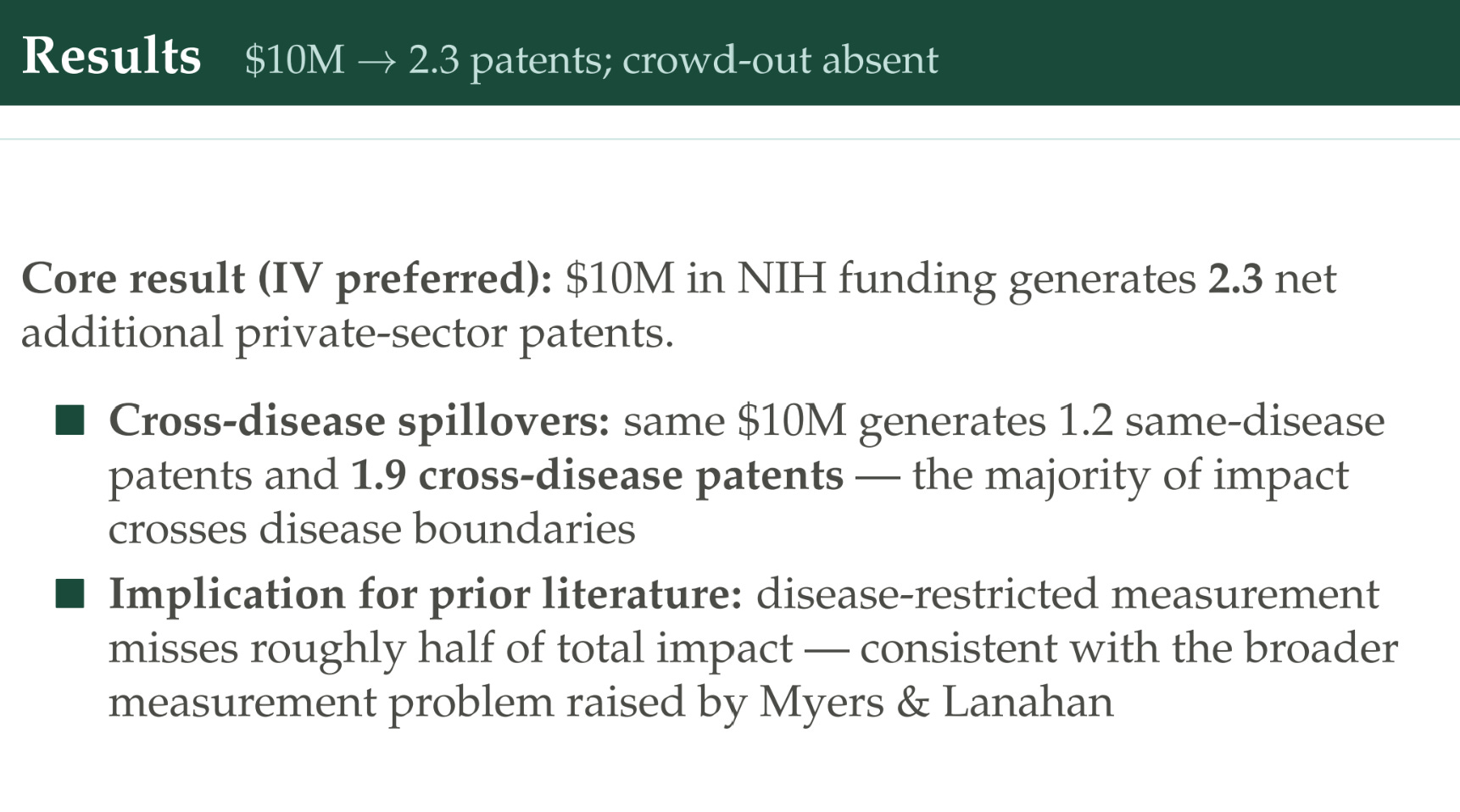
If we’re only looking at the impact from the same disease, we might miss half the story. That’s directionally consistent with Myers and Lanahan, which also found that a large share of the benefits come from spillovers to different areas than were directly targeted.
Now, in terms of valuing the returns — getting an ROI out of this.
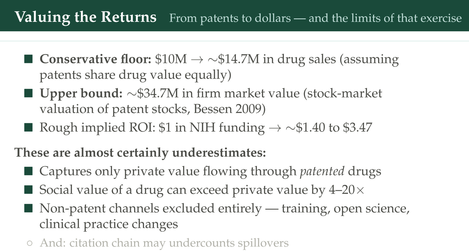
If you read this paper, you’re struck by how nervous they are to do this, and how cautious they want to be, because they recognize this is a hard question. It’s potentially an important question that people might run with, so they’re nervous about saying, “We know what the ROI is.” There’s a lot of uncertainty. But here’s the approach they take. How are we going to value the benefits?
One thing we could do is look at drug sales. That finds $10 million in grants leads to $14.7 million in drug sales.
A second approach is to use those firm stock-market valuations: when the drug patent gets announced, what happens to the stock-market price of the firm that owns it? You get $34.7 million.
This gives you a rough ROI: $1 in NIH funding is giving you $1.40-$3.47. But importantly, we think these have to be underestimates for a few reasons.
We’re only capturing the private value to the pharma company — the drug sales, the stock-market valuation — and only through patented drugs (most drugs are patented, but not necessarily all of them).
We’re not thinking about the social value of a drug. Some papers argue that firms only often capture a small value of the total consumer surplus.
There could also be non-patent channels that are still important in medicine — clinical-practice changes, surgical techniques. Also training: NIH might be important because it trains somebody who then goes on to work on science that is not connected via these citation chains to any of the other work they got the grant for — but that grant still was a causal chain in their ability to have a biomedical career.
Lastly, the citation chains might undercount spillovers.
Let’s look at this framework for evaluating the paper:
On scope: biomedical patents is in some ways better, because we know a large share of the drugs that come out of biomedicine do get patents — but we’re still only looking at health outcomes, private-sector returns, and we can’t see these non-patent channels.
On cost: again we’re only going to look at the cost of the NIH grant, not the subsequent cost to run the clinical trials to get FDA approval, and those can be really large.
Lags: this is a strong suit of the paper — they don’t have to make assumptions; they can be agnostic and let the citations show where the links happen.
On identification: another thing they think carefully about, with this rank-of-ranks approach. As it happens, there’s not a huge difference between their rank-of-ranks instrumental-variables approach and just classic OLS where you add a lot of controls — so they argue the selection effect is not going to be that strong, and it might be that the rank of ranks is just not that good at selecting the top science.
On measurement: this cross-disease linkage is an interesting spillover story.
Dyèvre: all federal agencies and firm productivity
Next, let’s turn to Arnaud Dyèvre. He’s going to zoom us out even further.
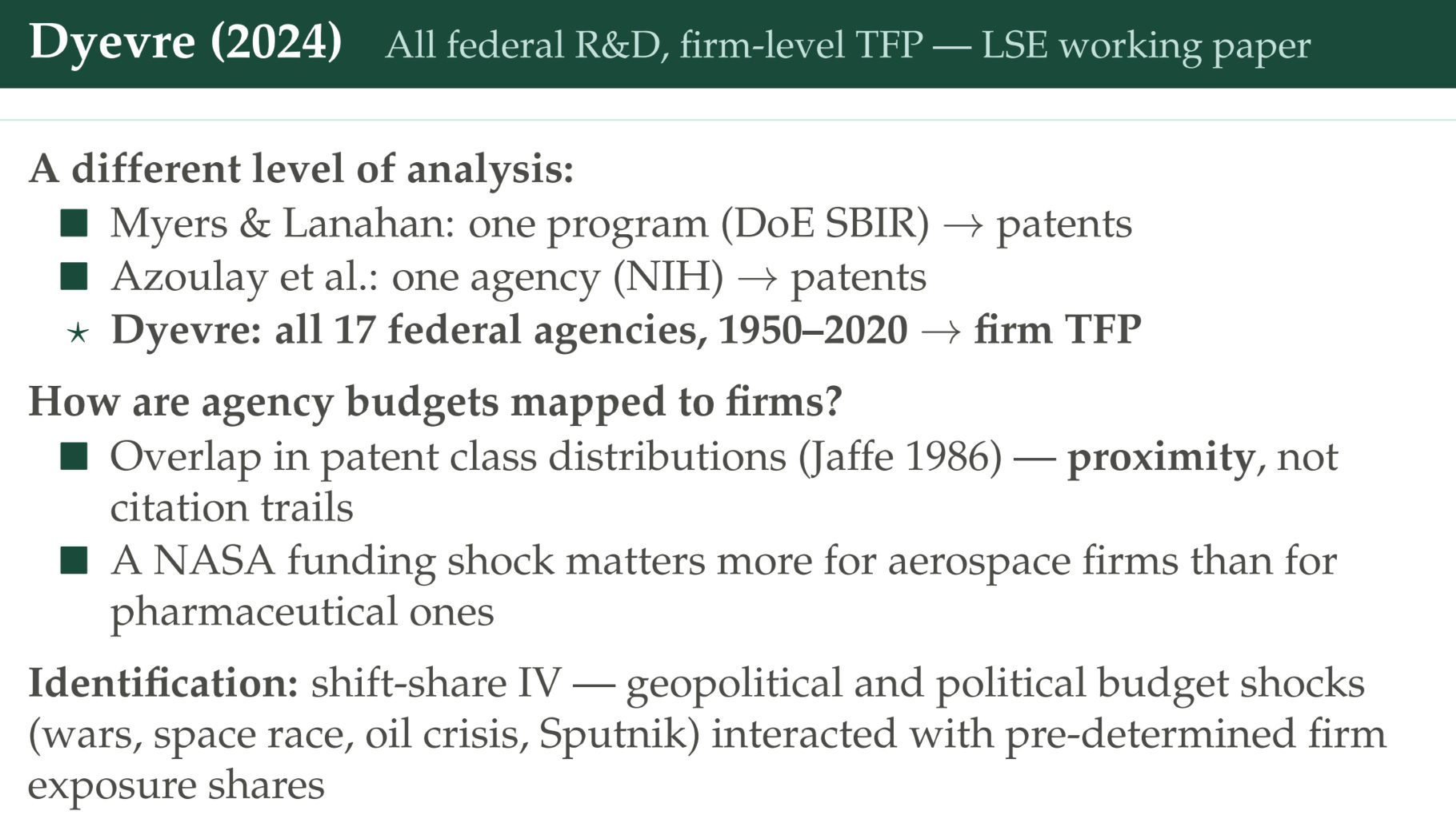
First we looked at the Department of Energy SBIR program, then all of NIH, and now we’re going to look at all 17 federal agencies. We’re going to look at a long time series, 1950 to 2020, and instead of looking at patents, we’re going to look at firm total factor productivity.
How are we going to approach this? We’re going to use patents — but not as a measure of innovation, more like a measure of where you live in innovation space. Agencies sometimes get patents for their work. We’re not going to count patents to see how much innovation the Department of Agriculture did. Instead, we’re going to say: the Department of Agriculture got patents related to corn in this year — that’s a signal that they were doing R&D related to corn. The Department of Energy got patents on solar technology in the 2000s, but wind power in the 1980s, and that’s telling us something about the character of the research they were doing at different times.
Then we can look at the firms’ patents and say, “This firm is working on wind technology, so it probably cares about what the Department of Energy was doing back in the 1980s.” (These are all examples; I don’t actually know when they were working on wind technology, but when they had patents that were similar.) But they don’t care about what the Department of Agriculture is doing, because they can see those patents have very little overlap with the technology classes this firm is working on. A NASA funding shock is going to matter more for an aerospace firm than a pharma firm, and we’re going to see which firms have aerospace patents to identify them.
The identification after that is going to be this shift-share instrumental variable: historically, how closely related am I to this agency’s R&D based on our overlap; and then if there’s a shock to its R&D spending, what happens to my TFP? He’s going to look at different kinds of shocks.
Here’s the variation in R&D budgets over time.
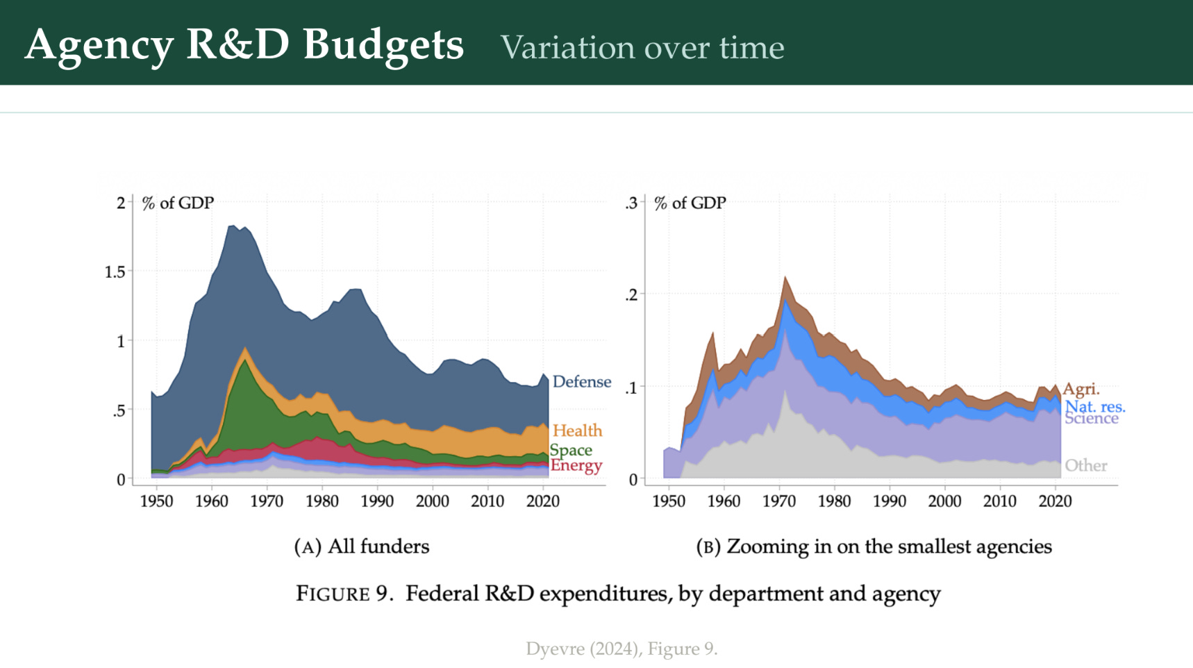
On the left, the overall; on the right, we’ve taken this purple line at the bottom and blown it up to zoom in on some of the smaller agencies. A couple of major things to see. This green line is space R&D — it exploded during the space race, was really large, but then tapered way down. Defense, as a share of R&D, has — surprisingly for some — tapered down over time. Health has grown from a tiny sliver to the second largest. The Department of Agriculture, where I worked, was very steady, although shrinking a bit in real terms.
Their core result is that a 1% increase in public R&D spillovers gives a 0.023-0.025% firm-level TFP increase after five years, and this is still persisting after 10 years. The effect is larger for small firms than large firms. He has a calibrated model showing that declining public R&D investment can explain various things we observe, like the rising firm-size inequality.
Let’s stick in this framework:
The scope is nice, in that we worry patents undercount a lot of innovation — I’ve written a series about that. In some fields patents are a pretty good capture of what’s going on, but in others most inventions don’t seem to be patented. So it’s nice to do something different: this is total factor productivity, which is itself very hard to measure well, but if you have a lot of firms over a long time, maybe the signal can come through the noise. Still, we’re only looking at firms that are publicly traded, because they’re in the Compustat dataset, so we’re going to miss private firms — which could be particularly acute for this paper if small firms are disproportionately private and benefit more from this R&D.
On cost — we’re looking at the federal agency budgets only, not the enabling R&D stock from the past.
Lags — we’re mostly pre-specifying 5 or 10 years based on a read of the literature.
Identification — the shift-share approach.
Breadth — a strength of the paper: all agencies, all technology areas, a long time series of 70 years.
Fieldhouse and Mertens: national TFP
The last empirical paper is Fieldhouse and Mertens. We went from one program looking at patents, to one agency looking at patents, to all agencies but looking at a subset of firms and their TFP. Now we’re going to look at all the major agencies and at national TFP. We’re going to capture all the spillovers, across five major agencies. If you’re getting the five major agencies, you’re getting a big chunk of the R&D that’s happening.
Why focus on national TFP? The downside is that you get one time series, which makes things a lot harder than when you’re Dyèvre and you’ve got all the firms and their trends of TFP, or lots of patents. But national TFP captures spillovers everywhere. If an individual firm goes out of business because it can’t compete, and there’s all this business-stealing effect, we’ll see how that all washes out in the aggregate, and that’s maybe valuable for us.
The approach: Fieldhouse and Mertens are going to do something inspired by this famous Romer and Romer paper, where they look at monetary policy statements to read what justified the monetary policy changes, and try to find shocks that were more random, or not correlated with changing economic circumstances, to understand monetary policy. What they’re going to do here is look through appropriation shocks. A shock in this case is an increase in a budget of more than 5% or a decrease of more than 2.5%. We’re going to read through the appropriation history and ask: “Why did we change the budget that much in that year?”
In particular, Fieldhouse and Mertens are most concerned about economic confounders — budget changes because of a recession, for example, leading to increasing a budget as a stimulus measure. If we’re looking at national TFP, we’re going to confound TFP changes driven by changing economic circumstances with the changes from R&D. So they’re going to read these things and try to find shocks that were not driven by economic circumstances.
Here we’ve got annual changes in these agency budgets.
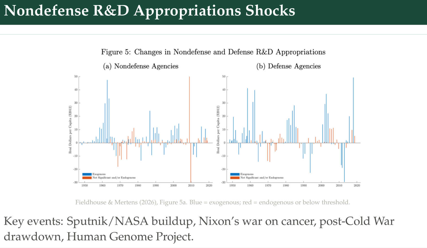
In blue, what they consider exogenous changes; in orange, endogenous changes. The big one is in 2008 and 2009 — the American Recovery and Reinvestment Act following the 2008 financial crisis. There was a huge stimulus package, and that increased the budget of, among other things, the NIH as part of the stimulus. They would count this as an endogenous shock, and we don’t want to be looking at those. We want to look at the times the budget was increased — like in the 2000s — more because, “We’re going to double the budget of the NIH because we think the value of science is high.” That introduces a different concern that they’re selecting on this endogenous technological opportunity — but we’ll come back to that.
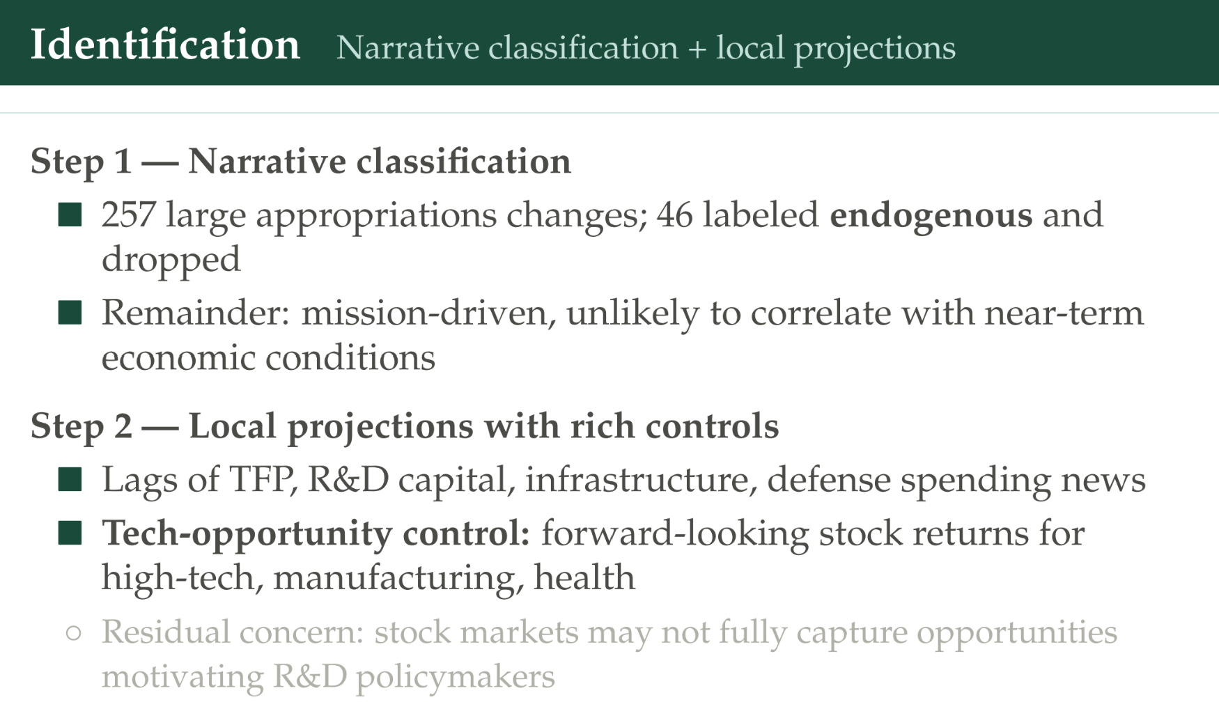
There are 257 large appropriation changes. About a fifth of them are endogenous, and they get dropped. The remainder they’re calling “mission-driven,” and they’re not correlated with economic conditions. They’re then going to look at — when you add some controls — what’s the correlation between changes in R&D capital stock and total factor productivity, or lots of other things you can observe at the national level.
What about this problem of technological opportunity, where we’re sometimes increasing the budget because we think there’s a good opportunity in this technology space? They’re going to try to control for that with control variables — the forward-looking stock returns for high-tech sectors, what the market expects the returns are going to be for the high-tech or the health sector, as ways to get at what expectations were at the time around where these technologies might go. You could believe that or not, but that’s the approach they take.
Here’s the knowledge-production pipeline.
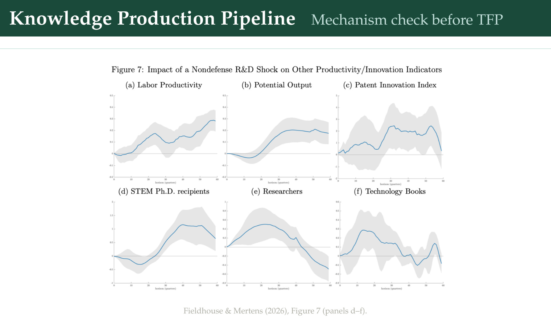
These charts show what happens on average to these different output measures when there’s a 1% increase in the non-defense R&D stock. An R&D stock is the weighted sum of all past R&D investments. We’re going to increase that by 1%. When you do that, labor productivity goes up over time. Potential output goes up. They look at a number of proxies you would expect to see if technology was also growing. Patent innovation — this is an index that looks at the text of patents, and if the patents are introducing surprising new terms that go on to be important, then we consider them more innovative patents — this goes up after a lag. The number of STEM PhD recipients goes up after a lag; the number of researchers goes up quickly; and the number of technology books goes up.
On the one hand, this does show there’s something happening to technology after you see these shocks to R&D stocks. I’m not sure the timing of these lines up quite as well — it’s not natural for me to assume that the technology books would happen before some of these other things — but this is what they find.
This is their core result.
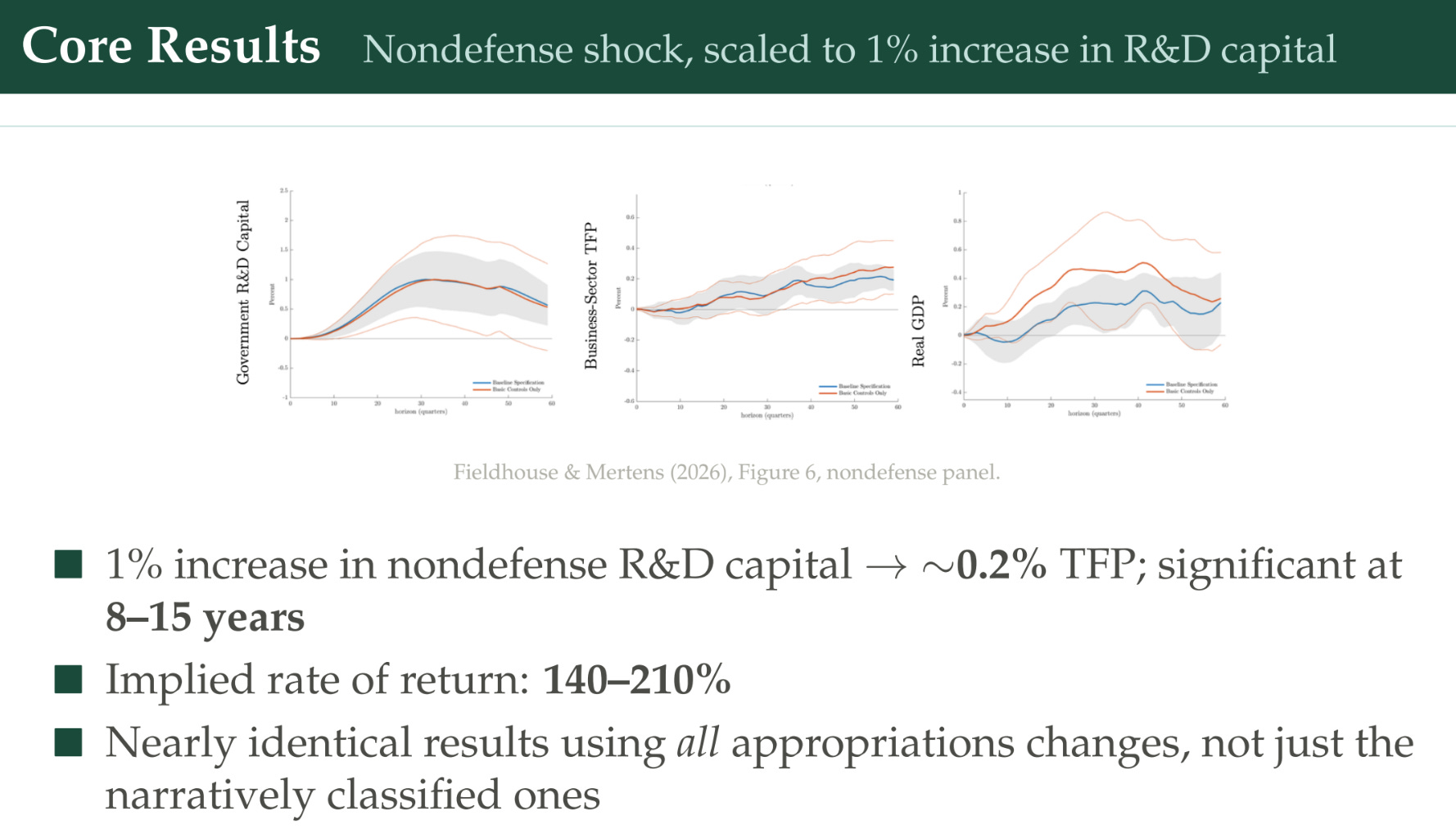
We have government R&D capital — how the capital stock evolves after a 1% positive shock to R&D capital stock. Business-sector TFP goes up over time. And real GDP. They’ve got this blue and this orange line, both capturing a bare-bones approach versus an approach with lots of controls. They find a 1% increase in non-defense R&D capital leads to a 0.2% increase in TFP, significant — this is 15 years out — and you can see the statistical significance in these gray bars.
Grading it:
Scope — the biggest scope: national total factor productivity. We’re getting all the spillovers wherever they land. This is the closest to what Jones and Summers’ hypothetical experiment was going to be like.
Costs — it’s not covering investment costs, but it’s including the R&D capital stock, not just the current spending or grants, so this is closer to all costs relative to all benefits of R&D.
Lags are open-ended; they’re not imposing a structure. They just say: when there’s a shock, let’s see what happens to productivity over time on average.
Identification is a challenge; we’ve highlighted some of these things, so you can compare that to the ones that have a tighter causal identification strategy.
Breadth is nice — all five major agencies.
Putting it together: is the evidence consistent?
The last step is: how does everything fit together? Fieldhouse and Mertens also report a long-run benefit-cost ratio.
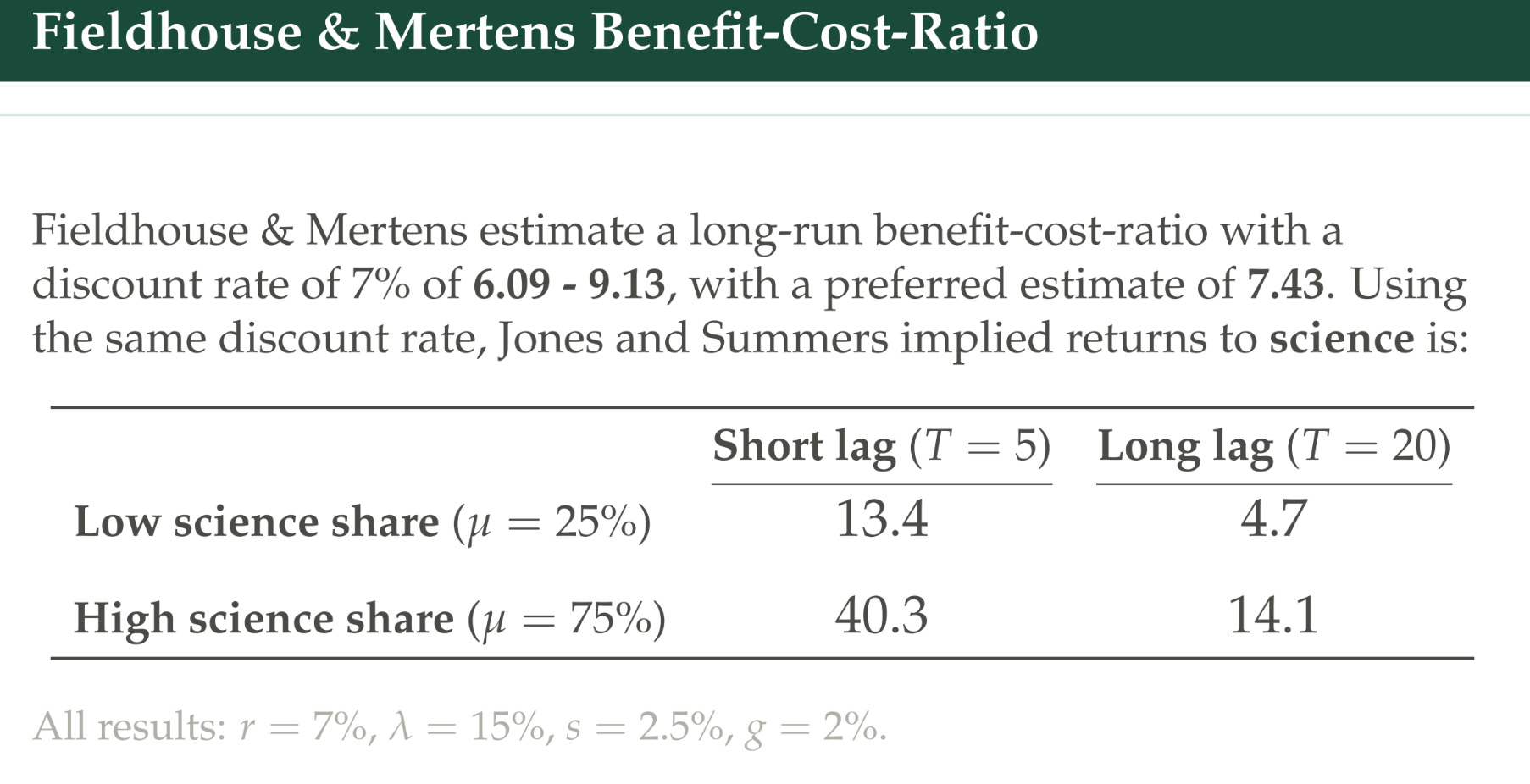
They use a discount rate of 7% rather than the 5% I talked about earlier. That gets you 6-9 for the benefit-cost ratio, with a preferred estimate of 7. Using the same discount rate — 7% — Jones and Summers gave us a range of numbers. The number Fieldhouse and Mertens come up with is in between these low-science-share, long-lag and short-lag numbers, and that probably makes sense: non-defense public spending is a mix of pure science that takes 20 years, and more applied development stuff that has a shorter timeline. So it’s in the theoretically supposed ballpark.
They also reported the internal rate of return.
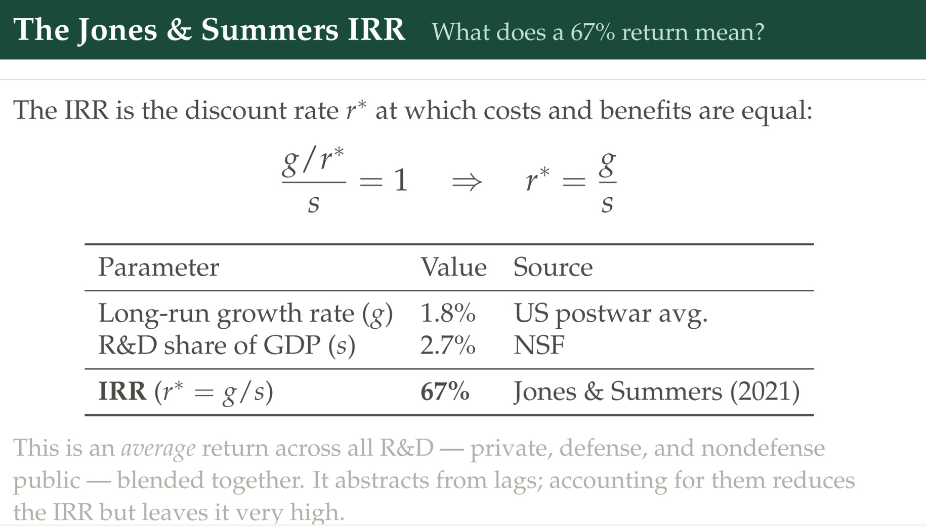
The internal rate of return is: instead of assuming a discount rate, use this formula to pick the discount rate that equalizes costs and benefits. If you do this with Jones and Summers, you can rearrange their equation by setting the benefit-cost ratio equal to one, pick these values for the growth rate and the R&D share of GDP, and they get an internal rate of return of about 67%.
This is really different from what Fieldhouse and Mertens got, so maybe initially we should be concerned — they found the return is 140-210%. Let’s think about this more carefully, though. 67% is what Jones and Summers do when they’re looking at the average return on all of R&D together — private-sector and public-sector mushed together. What if we only look at the private sector?
You probably covered Bloom, Schankerman, and Van Reenen, looking at Compustat data on publicly traded firms.
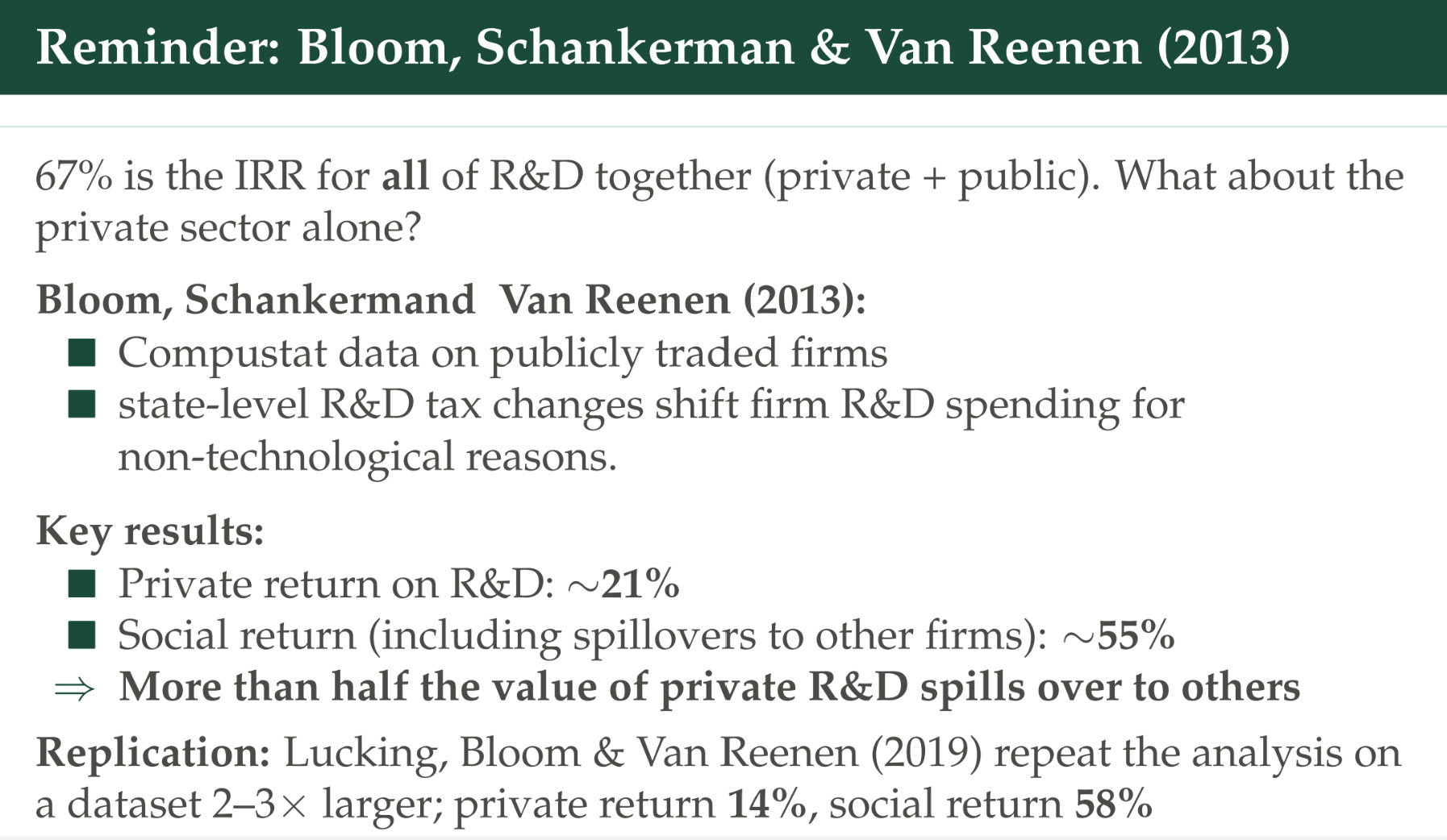
They used this instrument of when a state changed its tax credits, which shifted firm-level R&D spending, and then they could see what happens to TFP in the firms. They got that the private return on R&D was about 21%, and the social return, incorporating spillovers to rivals, was 55%. I should also point out that this paper got replicated in 2019 with a bigger dataset, and they got very similar answers.
Let’s see if this all fits together.
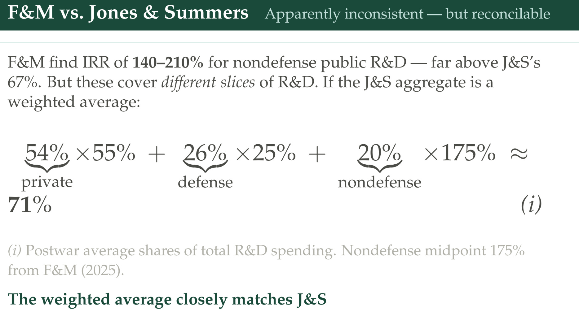
Fieldhouse and Mertens get 140-210% for non-defense public R&D. Instead of just comparing those numbers, let’s think about what the weighted average should be. If we think the private sector is 54% of all R&D spending over the 1950-2020 period, and the average return is roughly 55% — what we got with the Bloom and Schankerman paper — then we have the non-defense sector, which we think maybe on average has a 175% return (in the ballpark of what Fieldhouse and Mertens did), and 20% of R&D spending was non-defense. What about defense? Defense is big — it’s 26%. They show some evidence from what the Congressional Budget Office and others assume and argue that maybe the internal rate of return here is 25% — much lower, because we tend to think there aren’t as many spillovers, the research is classified, and there are fewer applications in the commercial sector. If you make these assumptions, you get that the weighted-average internal rate of return is 71%. That’s pretty close to the 67% that comes out of the Jones and Summers calculation for what the average of all R&D should be.
Important to note: if non-defense R&D is only 20% of R&D, then the fact that it has this outrageously high number doesn’t necessarily move the total average around as much. And it’s useful to point out why non-defense R&D would have such a high rate of return. Remember, it’s not operating in a competitive environment where somebody is going to keep spending until the marginal return is equalized to its marginal cost. Recall that at the beginning we had some stylized facts from Dyèvre that showed public-sector patents tended to have these unusual features; non-defense research is more tilted to this basic stuff that we think has more spillovers.
The last thing we’re going to do is see if these are consistent across these papers.
Fieldhouse and Mertens directly compare their results to Dyèvre and argue they’re in a similar magnitude, so roughly consistent.
With Azoulay, though, there starts to be a gap that we’re not totally capturing. Azoulay finds a dollar in NIH funding generates $1.40-$3.47 in private benefits to the firm — but remember, the other papers are only looking at GDP; they’re not capturing consumer surplus themselves either. We know this is a conservative floor, but can we get all the way up to seven, which is the preferred benefit-cost-ratio estimate of Fieldhouse and Mertens for all R&D? What are we missing if that’s the case? Maybe NIH just has lower returns than other kinds of agency funding. After all, NIH is the biggest non-defense share of R&D, so maybe we’ve moved down the marginal cost curve there. But that would imply the other areas have returns even higher than 140-210%, which was the weighted average.
What about Myers and Lanahan? They don’t estimate the benefit-cost ratio, but if we assume — going way back to the beginning — that the private benefit-cost ratio is about one, which is something you can get out of equilibrium, and if we assume the social returns are two to four times higher, then that would imply the social benefit-cost ratio is 2-4. That’s similar to the Azoulay paper, but again isn’t getting us up to the seven that these other papers are implying. Maybe it’s a lag issue — maybe we need to be looking more than five years out. Maybe we’re missing a lot of the spillovers or the innovation by focusing on patents. But there’s still this discrepancy.
The fact that there are these discrepancies is one reason we’re interested in starting this Pop Up Journal project, which is going to try to make headway on this over the next couple of years — because there seems to be a lot of evidence pointing to the idea that the social returns are greater than one. But what should it be more specifically? Harder to say.
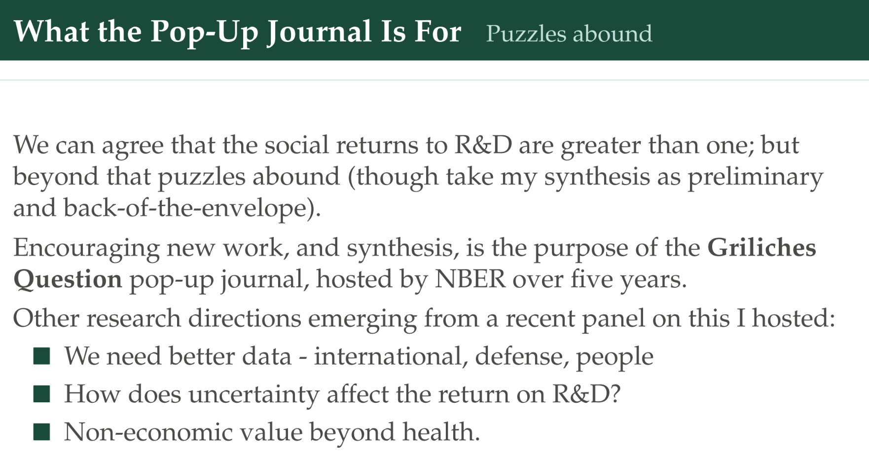
I hosted a panel about these questions recently, and Fieldhouse was on it along with other people. They argue we need better data — especially international data on R&D, TFP, and the people who are doing the R&D. We have to think about how uncertainty affects the return on R&D. And especially, politicians and people in the constrained government making decisions about how much to spend — they care a lot about these non-economic values of R&D that they’re trying to achieve by funding it, and it would be good for the field to be responsive to the needs of these policymakers.